-
 Streams
-
Compute
- Overview
- Group By Ranges & Buckets
- Data Explorer Guide
- Video Completion Funnel
- Saved Queries
- Compute Pricing Guide
- Custom Ad Performance
- Session Timing Metrics
- Cohort Analysis
- Retention Analysis
- Funnel Analysis
- Creating a Funnel with an OR Condition
- Stripe Revenue Queries
- Create a Email Nightly Report
- Query Tuning
- Cached Queries
- Cached Datasets
- Paid Session Metrics
- User Engagement
-
Visualize
Stripe Revenue Queries
What could be more important to track than your purchase events? If you’re using Stripe, you’re in luck. Did you know it’s quite simple to integrate Stripe and Keen? We even made an embarrassingly gushing video about how to set up the integration in 60 seconds.
If video’s not your thing, the steps are:
Step 1. Look up your project ID & write key in Keen. Use them to construct a URL where Stripe will post your events, like this:
https://api.keen.io/3.0/projects/PROJECT_ID/events/Stripe_Events?api_key=WRITE_KEY
Step 2. Log into Stripe and find the account settings section for webhooks. Add the URL you just created.
Step 3. Wait for events to come in! (If you want, you can create a new Stripe customer so that a new event is created immediately. It should show up in Keen right away, in a new collection called ‘Stripe_Events’.)
Now what to do with all this Stripe data? Here are a few queries we use on our internal dashboard, which uses the keen-analysis.js and keen-dataviz.js libraries.
This guide will cover computing and visualizing:
- Sum of Last 30 Days’ Revenue
- Revenue Line Chart
- New Customer Conversions
- Total Unique Paying Customers
- Number of New Paying Customers
- Revenue from New Customers
Sum of Last 30 Days’ Revenue
The last 30 days' revenue can serve as a quick estimate for MRR. Here’s how we calculate it and display it in dollars (e.g. $56.3k), in a div with id “revenueAmountText”:
var client = new Keen({
  projectId: "YOUR_PROJECT_ID",
  readKey: "YOUR_READ_KEY"
});

// ===============================
// Create a new Dataviz instance
// ===============================

var chart = new Dataviz()
  .el('#revenueAmountText')
  .title("Last 30 Days\' Revenue")
  .chartOptions({ prefix: "$" })
  .type('metric')
  .prepare();

// ===============================
// Calculate Stripe Revenue Metric
// ===============================

client
  .query('sum', {
    event_collection: 'Stripe_Events',
    timeframe: 'last_30_days',
    target_property: 'data.object.amount',
    filters: [
      {
        property_name:'type',
        operator:'eq',
        property_value:'charge.succeeded'
      }
    ]
  })
  .then(function(res) {
    // Handle the result
    chart
      .data({ result: res.result / 10 })
      .render();
  })
  .catch(function(err) {
    // Handle the error
    chart
      .message(err.message);
  });
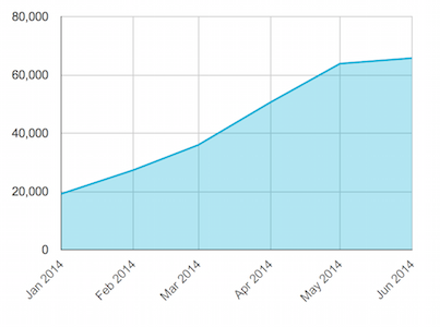
Revenue Line Chart
Wanna show your revenue growing over time? Simply use a Sum query to add up all your charge_succeeded events!
var client = new Keen({
  projectId: "YOUR_PROJECT_ID",
  readKey: "YOUR_READ_KEY"
});

// ===============================
// Create a new Dataviz instance
// ===============================

var chart = new Dataviz()
  .el('#revenueLineChart')
  .title('Revenue per month')
  .chartOptions({
    hAxis: {
      slantedText: true,
      slantedTextAngle: 45
    },
    legend: { position: 'none' }
  })
  .type('line')
  .prepare();

// ======================================
// Create Revenue Over Time Line Chart
// ======================================

client
  .query('sum', {
      event_collection: 'Stripe_Events',
      timeframe: 'last_6_months',
      target_property: 'data.object.amount',
      interval: 'monthly',
      filters: [{
          property_name:'type',
          operator:'eq',
          property_value:'charge.succeeded'
      }]
  })
  .then(function(res) {
    // Handle the result
    chart
      .data(res)
      .call(function() {
        this.dataset.updateColumn(1, function(value, index, column) {
          // Divide each value in column 1 by 100
          return value / 100;
        });
      })
      .render();
  })
  .catch(function(err) {
    // Handle the error
    chart
      .message(err.message);
  });
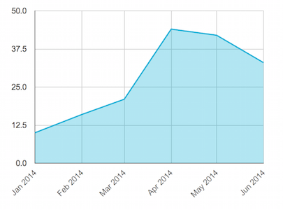
New Customer Conversions
Here at Keen, we ring a gong every time an account converts into a paying account. Our internal stats page also has a line chart showing the number of “gongs” we get each month.
Here’s how we do it:
var client = new Keen({
  projectId: "YOUR_PROJECT_ID",
  readKey: "YOUR_READ_KEY"
});

// ===============================
// Create a new Dataviz instance
// ===============================

var chart = new Dataviz()
  .el('#newCustomerConversionAreaChart')
  .title('New Customer Conversions')
  .chartOptions({
    hAxis: {
      lantedText: true,
      slantedTextAngle: 45
    },
    legend: { position: 'none' }
  })
  .type('area')
  .prepare();

// ================================================
// Create New Customer Sales Conversions Line Chart
// ================================================

client
  .query('count', {
      event_collection: 'Stripe_Events',
      timeframe: 'last_6_months',
      interval: 'monthly',
      filters: [{
          property_name:'type',
          operator:'eq',
          property_value:'customer.subscription.updated'
      },
      {
          property_name:'data.object.plan.amount',
          operator:'gt',
          property_value: 0
      },
      {
          property_name:'data.previous_attributes.plan.amount',
          operator:'eq',
          property_value: 0
      }]
  })
  .then(function(res) {
    // Handle the result
    chart
      .data(res)
      .render();
  })
  .catch(function(err) {
    // Handle the error
    chart
      .message(err.message);
  });
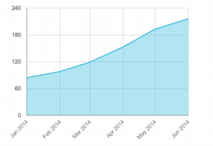
Total Unique Paying Customers
If you want to see your total number of paying accounts grow over time, try this visualization of the number of accounts making payments.
var client = new Keen({
  projectId: "YOUR_PROJECT_ID",
  readKey: "YOUR_READ_KEY"
});

// ===============================
// Create a new Dataviz instance
// ===============================

var chart = new Dataviz()
  .el('#totalUniquePayingCustomerAreaChart')
  .title('Total Unique Paying Customers')
  .chartOptions({
    hAxis: {
      lantedText: true,
      slantedTextAngle: 45
    },
    legend: { position: 'none' }
  })
  .type('area')
  .prepare();

// =========================================
// Create Unique Paying Customers Line Chart
// =========================================

client
  .query('count_unique', {
      event_collection: 'Stripe_Events',
      timeframe: 'last_6_months',
      target_property: 'data.object.customer',
      interval: 'monthly',
      filters: [{
          property_name:'type',
          operator:'eq',
          property_value:'invoice.payment_succeeded'
      },
      {
          property_name:'data.object.total',
          operator:'gt',
          property_value: 0
      }]
  })
  .then(function(res) {
    // Handle the result
    chart
      .data(res)
      .render();
  })
  .catch(function(err) {
    // Handle the error
    chart
      .message(err.message);
  });
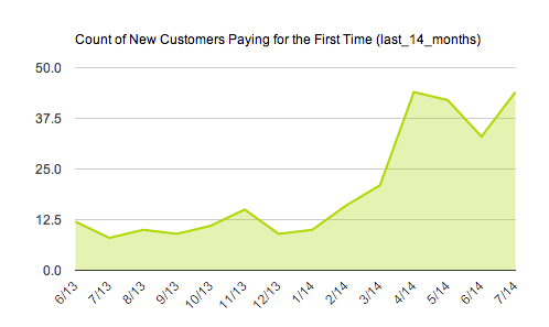
Number of New Paying Customers
Nothing is more exciting than seeing your customer base grow across time! To see the number of new paying customers paying for the first time, try this visualization.
var client = new Keen({
  projectId: "YOUR_PROJECT_ID",
  readKey: "YOUR_READ_KEY"
});

// You may want to have a variable timeframe, like from a dropdown box, you can set the timeframe here

var timeframe = 'last_6_months';

// ===============================
// Create a new Dataviz instance
// ===============================

var chart = new Dataviz()
  .el('#newCustomersPayingAreaChart')
  .title('Count of New Customers Paying for the First Time (' + timeframe + ')')
  .chartOptions({
    hAxis: {
      lantedText: true,
      slantedTextAngle: 45
    },
    legend: { position: 'none' }
  })
  .type('area')
  .prepare();

// ========================================================
// Create Line Chart of New Customers Paying for First Time
// ========================================================

client
  .query('count', {
      event_collection: 'Stripe_Events',
      timeframe: timeframe,
      interval: 'monthly',
      filters: [{
          property_name:'type',
          operator:'eq',
          property_value:'customer.subscription.updated'
      },
      {
          property_name:'data.object.plan.amount',
          operator:'gt',
          property_value: 0
      },
      {
          property_name:'data.previous_attributes.plan.amount',
          operator:'eq',
          property_value: 0
      }]
  })
  .then(function(res) {
    // Handle the result
    chart
      .data(res)
      .render();
  })
  .catch(function(err) {
    // Handle the error
    chart
      .message(err.message);
  });
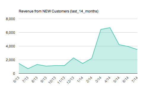
Revenue from New Customers
To see the revenue you’re deriving from these treasured NEW customers, we can create a line chart to help visualize all new revenue coming in over time.
var client = new Keen({
  projectId: "YOUR_PROJECT_ID",
  readKey: "YOUR_READ_KEY"
});

// You may want to have a variable timeframe, like from a dropdown box, you can set the timeframe here

var timeframe = 'last_6_months';

// ===============================
// Create a new Dataviz instance
// ===============================

var chart = new Dataviz()
  .el('#revenueNewCustomersAreaChart')
  .title('Revenue from NEW Customers (' + timeframe + ')')
  .chartOptions({
    hAxis: {
      lantedText: true,
      slantedTextAngle: 45
    },
    legend: { position: 'none' }
  })
  .type('area')
  .prepare();

// ============================================
// Create Revenue from NEW Customers Line Chart
// ============================================

client
  .query('sum', {
      event_collection: 'Stripe_Events',
      timeframe: timeframe,
      target_property: 'data.object.plan.amount',
      interval: 'monthly',
      filters: [{
          property_name:'type',
          operator:'eq',
          property_value:'customer.subscription.updated'
      },
      {
          property_name:'data.object.plan.amount',
          operator:'gt',
          property_value: 0
      },
      {
          property_name:'data.previous_attributes.plan.amount',
          operator:'eq',
          property_value: 0
      }]
  })
  .then(function(res) {
    // Handle the result
    chart
      .data(res)
      .call(function() {
        this.dataset.updateColumn(1, function(value, index, column) {
          // Divide each value in column 1 by 100
          return value / 100;
        });
      })
      .render();
  })
  .catch(function(err) {
    // Handle the error
    chart
      .message(err.message);
  });
If there’s anything else you are having trouble visualizing, let us know!
