-
 Streams
-
Compute
- Overview
- Group By Ranges & Buckets
- Data Explorer Guide
- Video Completion Funnel
- Saved Queries
- Compute Pricing Guide
- Custom Ad Performance
- Session Timing Metrics
- Cohort Analysis
- Retention Analysis
- Funnel Analysis
- Creating a Funnel with an OR Condition
- Stripe Revenue Queries
- Create a Email Nightly Report
- Query Tuning
- Cached Queries
- Cached Datasets
- Paid Session Metrics
- User Engagement
-
Visualize
Cohort Analysis
Cohort analysis is a subset of behavioral analytics that takes data and breaks them into related groups for analysis. These related groups, or cohorts, usually share common characteristics or experiences within a defined timespan. Cohort analysis enables you to see patterns within the defined timespan by slicing the analysis with defined time intervals. Cohort Analysis can help you understand and measure the effectiveness of a feature or application. You can check out our blog on Cohort Analysis.
Here are some common ways to sort users into cohorts:
- Signup date - compare people who signed up in week 1 vs people who signed up in week 2, 3, 4, etc
- Referrer - compare users based on how they found you (twitter, blog post, adwords, facebook campaign)
- App version - compare users based on their app version (e.g. version 1.0, 1.1, 1.2)
- A/B testing - compare users based on what alternative of your app they are using (e.g. version A or B)
This guide provides an example of how to chart cohorts over time.
Cohorts Over Time
Add the group_by parameter to any series to group the results by a certain type of property.
The series query looks like this:
https://api.keen.io/3.0/projects/PROJECT_ID/queries/count?api_key=READ_KEY&event_collection=create_user&timeframe=previous_4_weeks&group_by=mechanism&interval=weekly
And the result looks like this:
{
  "result": [
    {
      "timeframe": {
        "end": "2012-12-23T00:00:00+00:00",
        "start": "2012-12-16T00:00:00+00:00"
      },
      "value": [
        {
          "mechanism": "github signup",
          "result": 12
        },
        {
          "mechanism": "added to project",
          "result": 3
        },
        {
          "mechanism": "web signup",
          "result": 24
        }
      ]
    },
    {
      "timeframe": {
        "end": "2012-12-30T00:00:00+00:00",
        "start": "2012-12-23T00:00:00+00:00"
      },
      "value": [
        {
          "mechanism": "added to project",
          "result": 2
        },
        {
          "mechanism": "github signup",
          "result": 10
        },
        {
          "mechanism": "web signup",
          "result": 15
        }
      ]
    },
    {
      "timeframe": {
        "end": "2013-01-06T00:00:00+00:00",
        "start": "2012-12-30T00:00:00+00:00"
      },
      "value": [
        {
          "mechanism": "added to project",
          "result": 2
        },
        {
          "mechanism": "web signup",
          "result": 11
        },
        {
          "mechanism": "github signup",
          "result": 6
        }
      ]
    },
    {
      "timeframe": {
        "end": "2013-01-13T00:00:00+00:00",
        "start": "2013-01-06T00:00:00+00:00"
      },
      "value": [
        {
          "mechanism": "web signup",
          "result": 11
        },
        {
          "mechanism": "github signup",
          "result": 4
        }
      ]
    }
  ]
}
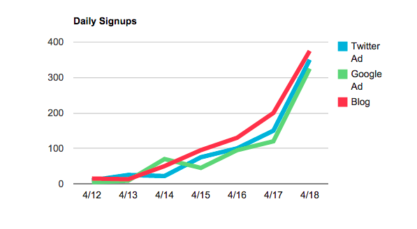
Using this data, you can generate the following chart: