-
 Streams
-
Compute
- Overview
- Group By Ranges & Buckets
- Data Explorer Guide
- Video Completion Funnel
- Saved Queries
- Compute Pricing Guide
- Custom Ad Performance
- Session Timing Metrics
- Cohort Analysis
- Retention Analysis
- Funnel Analysis
- Creating a Funnel with an OR Condition
- Stripe Revenue Queries
- Create a Email Nightly Report
- Query Tuning
- Cached Queries
- Cached Datasets
- Paid Session Metrics
- User Engagement
-
Visualize
Dashboard Edition
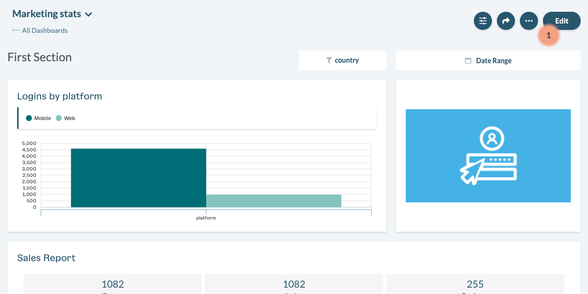
Navigate to the “Dashboards” in the Keen app and open the dashboard you would like to modify. To open a dashboard in edit mode, click “Edit” in the top right-hand corner (1).
 The dashboard opened in preview mode
Dashboards widget
Creating a widget
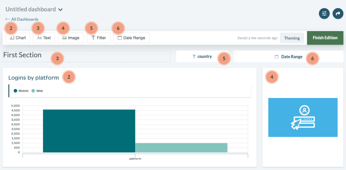
To create a new widget, open a dashboard in edit mode. Then, either click on a specific widget type in the editor bar or drag and drop it on a dashboard grid space. Clicking on a widget type will add the widget to the bottom of your dashboard.
Currently, the Dashboard Creator supports 5 widget types:
 The toolbar in dashboard edit mode
Chart (2) - Charts presents your query result visually. During configuration, you can decide to use an existing saved query or create a new one from scratch.
Text (3) - Text allows you to add written context, style, and organization to your dashboard. In advanced text widget configuration, you can specify properties like font size, color, and other typography settings.
Image (4) - Images allow you to add visual context, style, and organization to your dashboard. You must provide a source URL for the image.
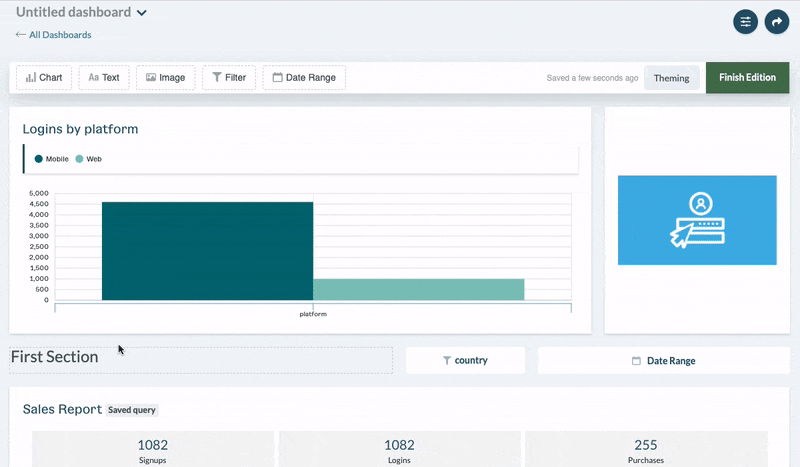
Filter (5) - Filters temporarily modify chart data by applying specific ad-hoc filter settings. The single filter widget could be connected to multiple charts built on the same event stream. A single chart widget can be connected to multiple filters.
Date Range (6) - Date Ranges temporarily modify timeframes for queries used as a chart data source. A date range widget can be connected to one or more charts.
Configuring a Widget
After a widget is created, it must be configured. You can always modify and reconfigure it later.
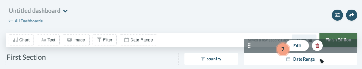
To edit widget configuration, hover over the selected widget item and click the “Edit” button (7).
 Edit button for a Date Range widget
Each widget type has a different set of configuration options.
Chart
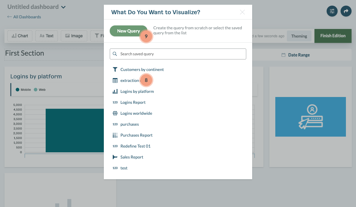
Charts visualize the connected data source. When adding a chart, you can use an existing Saved Query (8) or create an ad-hoc chart from scratch (9).
 Initial chart widget settings modal
Using a Saved Query
You can think of “Saved Queries” as templates that can be reused on multiple dashboards. You can edit them in the Data Explorer or directly in the Dashboard Creator. When you modify and update a chart linked with a Saved Query, the changes will be automatically propagated to all dashboards. You also have the option to disconnect the changes from the Saved Query and the query will only exist at the specific dashboard level.
We recommend to use Saved Queries for:
- Placing the same metric on multiple dashboards
- Creating reusable templates that could be instantly placed on a dashboard to present data and later easily modified
- Creating charts that do not required the latest analysis results and leverage Keen API cache possibilities
Creating a Query from Scratch
When a chart is created from scratch, it will only exist at the specific dashboard level. Modifying it will not affect any other dashboards. Additionally, a query built from the dashboard view will not be added to your Saved Queries list (even if you clone that dashboard).
We recommend to use ad hoc queries for:
- Creating metric that will be used only on single dashboard
- Isolating metrics placed on dashboards from Data Explorer
Chart Properties
All initial chart configuration settings can be changed at any time. To do this, hover over the chart and click “Edit”. This will open a chart editor that allows you to modify the chart type (10), query parameters (11), and chart settings (12).
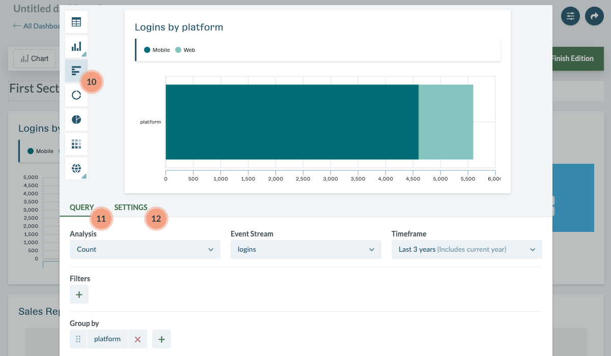 Chart editor modal
Chart (10) - Select your chart type. The arrow in the bottom, right-hand corner of the chart icon provides chart variants. The possible chart options are related to the query’s semantic structure. For example, data without intervals cannot be visualized as a line chart.
Query (11) - Specify the query parameters. Read about query parameters in more detail here.
Settings (12) - Select the settings for chart formatting including titles, subtitles, and value formatting.
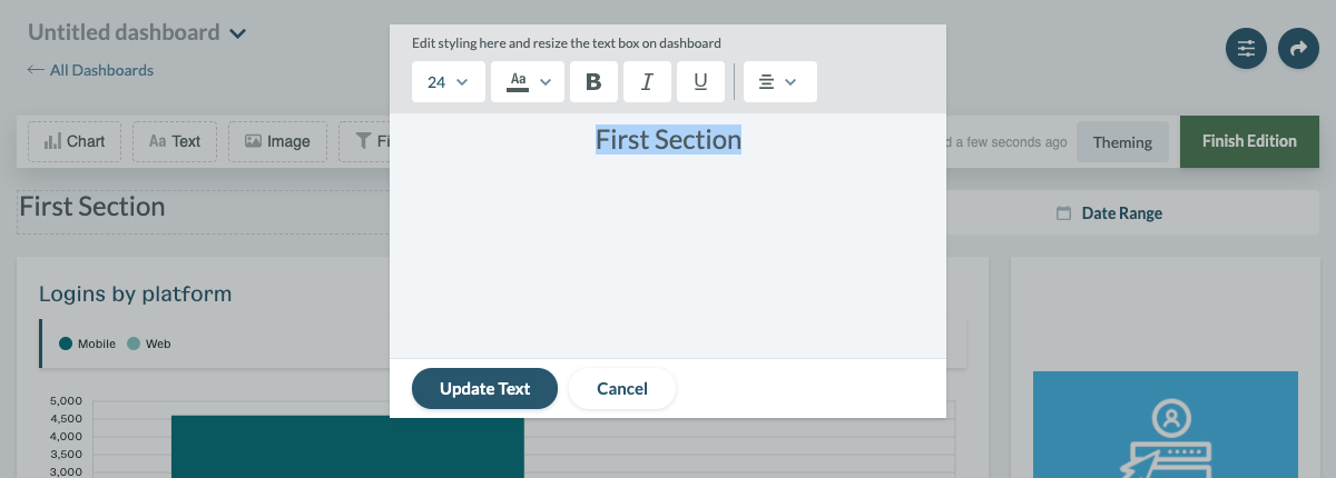
Text
Text allows you to add written context, style, and organization to your dashboard. You can configure text properties like font size, color, and other typography settings.
 Text configuration modal
Image
Images allows you to add visual context, style, and organization to your dashboard. You must provide a source URL for the image.
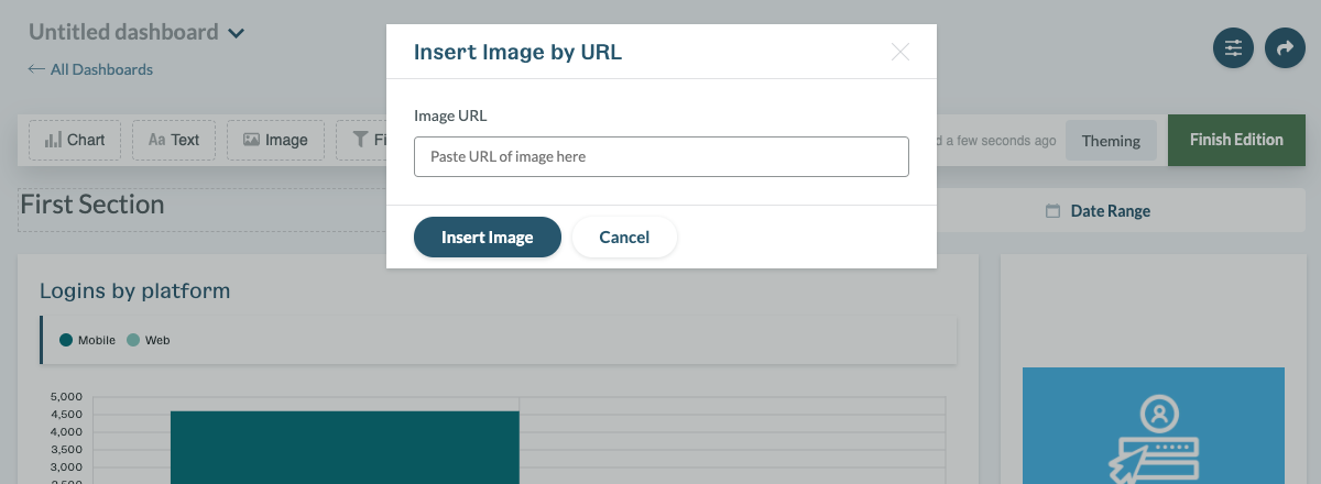 Image configuration modal
Filter
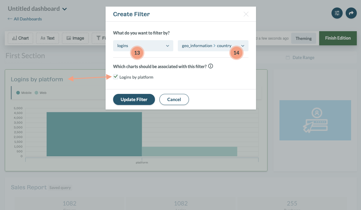
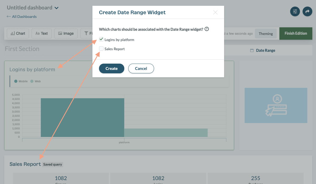
Filters temporarily modify a chart by applying ad-hoc filters enabling you to quickly isolate relevant segments of data at the dashboard level. To set up a filter, you need to first choose an event stream (13) then select one of the properties of the event stream (14).
Filters only support the string property type from the selected event stream schema. The stream and property can be modified anytime you decide that you need to use a different configuration.
 Filter widget configuration modal
Finally, select which charts should be associated with your new filter. Filters are applied by event stream, so only charts using the same stream can be associated.
Each chart widget can be connected with multiple filters.
Date Range
Date Ranges temporarily modify the timeframe for all associated charts allowing you to easily adjust the time period at the dashboard level.
Charts can only be associated with one Date Range at a time. If you want to connect a specific chart with a different Date Range, you must remove the existing connection first. When the Date Range is removed, all connected charts are automatically available to be associated with a new Date Range.
 Date Range configuration modal
Organizing widgets on the dashboard
Positioning a Widget
You can easily change the position of each widget on a dashboard. To set a new position, simply hover over a specific widget, and grab the black overlay or drag icon. This will allow you to drag and drop the widget in the new, desired position.
Repositioning widgets
Resizing a widget
You can easily change the size of a chart, image, and text widget. To edit the widget size, hover over the specific widget in dashboard edit mode and use the resize arrow indicator in the bottom, right-hand corner. Drag the arrow and release once the widget is the desired size.

Resizing widgets
Removing a widget
To remove a widget, hover over the selected widget and click on the “Delete” icon (15).
Cloning a widget
To clone a widget, hover over the selected widget and click on the “Clone” icon (16). The newly cloned widget will be automatically placed at the bottom of the page. The filter and date range widgets cannot be cloned.
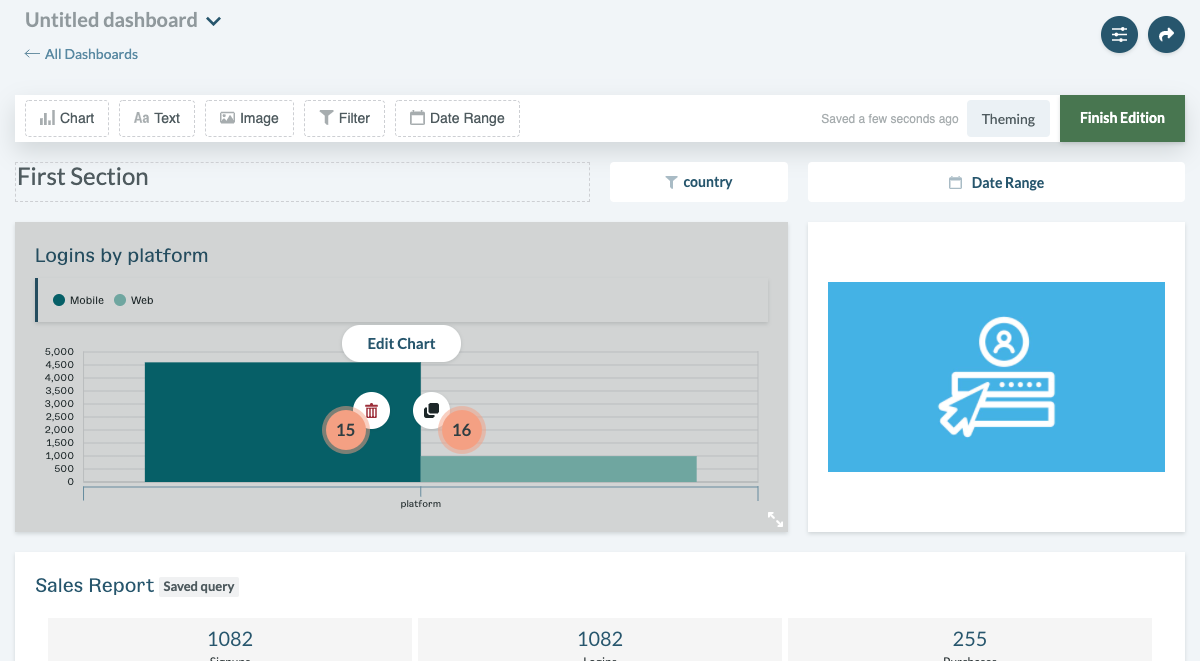 Chart widget with additional edit options visible when mouse hovers the chart
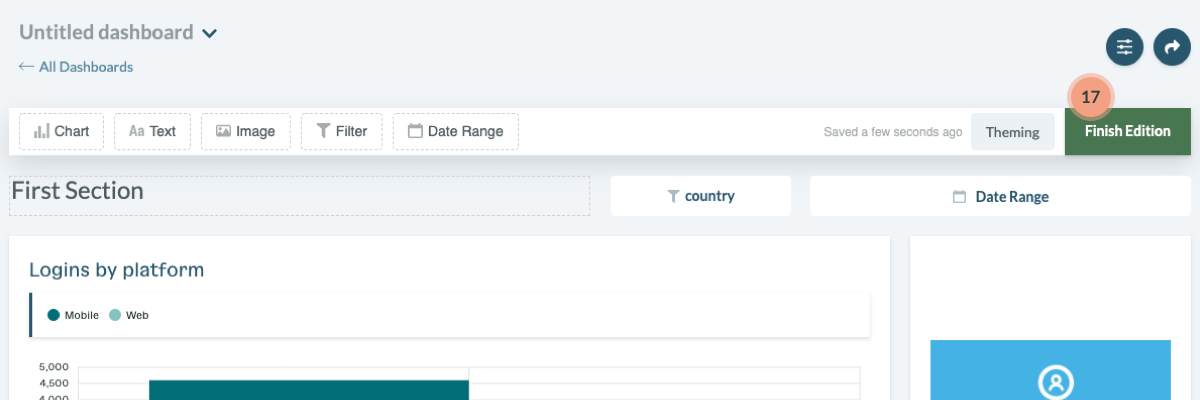
Finishing dashboard edition
When you apply all modifications, you can close the edition mode and preview your data. If you are ready to switch to the preview mode, click the “Finish Edition” button (17) on the right side of the edition bar. You can start interacting with your data.
 The dashboard in the edition mode
