-
 Streams
-
Compute
- Overview
- Saved Queries
- Data Explorer Guide
- Group By Ranges & Buckets
- Video Completion Funnel
- Compute Pricing Guide
- Custom Ad Performance
- Session Timing Metrics
- Cohort Analysis
- Retention Analysis
- Funnel Analysis
- Creating a Funnel with an OR Condition
- Stripe Revenue Queries
- Create a Email Nightly Report
- Query Tuning
- Cached Queries
- Cached Datasets
- Paid Session Metrics
- User Engagement
-
Visualize
Data Explorer Guide
Getting Started with the Data Explorer UI
The Data Explorer is a tool in the Keen app that enables users to perform a wide array of analysis on their data by creating, running, and managing queries.
This guide covers:
Analyze Your Data Using the Data Explorer
Once you have completed our onboarding, you can proceed to Step 1 below:
Step 1: Login to your Keen Account and Click on the “Streams” Tab
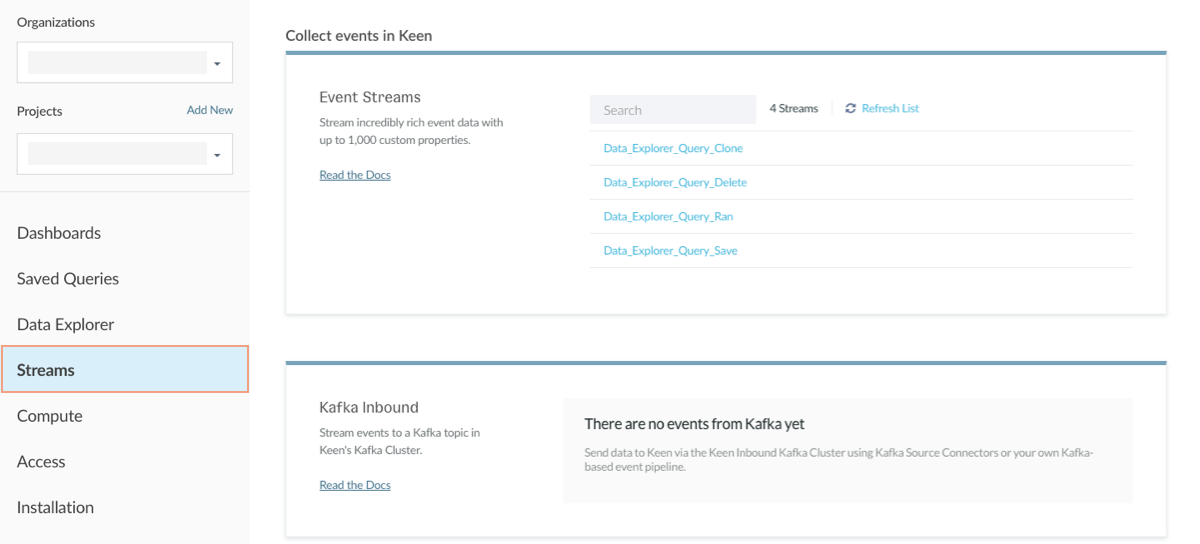
Under the Streams tab, you will see all Event Collections that have been streamed into your project. You can click into a collection to view the properties associated with an event as well as the values for recent events in the collection
Step 2: Click the “Data Explorer” Tab to start running some basic Queries
The Data Explorer offers you an easy way to perform flexible analysis on your event collections by running queries. Queries have adjustable parameters that allow you to analyze data however you need. This includes the ability to select time frames and intervals, apply filters, and specify how results should be grouped and ordered. Queries can be run once for ad-hoc analysis or saved and easily re-run for reports that will be used frequently. The following example covers query parameters in more detail.
- Analysis Type - there are 12 analysis types (including raw extractions and funnels) for you to choose from. Here is a link to read up on what those are.
- Event Stream - used to logically organize all the events happening in your application like clicks, pageviews, form submissions, and more. Events belong in a collection together when they can be described by similar properties.
- Target Property - the number of properties in a data set can vary from a few to as many as a thousand. The Target Property specifies which property to perform the selected analysis on.
- Timeframe - you can choose between Relative or Absolute timeframes when extracting your data. When using a Relative timeframe, “this” 14 days means you are extracting data from the last 14 days including the current day.
- Filters - adding “Filters” allow you to refine the scope of your query. Only events that match the criteria will be included in the analysis.
- Group By - adding “Group By” properties allow you to view results categorically.
-
Order by - adding “Order By” allows you to sort the results in ascending or descending order based on a target property. You can also specify a number to limit the results to.
- Interval - adding an “Interval” such as daily, weekly, or monthly, will set the frequency of the results within the given time frame such as daily for “this 14 days”.
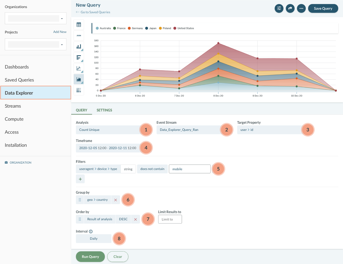
The above query counts unique desktop and tablet users who ran a Data Explorer query in the last 5 days grouped by the top 5 countries. To create this query:
- Enter
count uniqueas the “Analysis Type”. - Select
Data_Explorer_Query_Ranas the “Event Stream”. - Set
user > idas the “Target Property” to count unique users. - Selec the timeframe as “Last 5 days”.
- Filter by
useragent > device > type“does not contain mobile” to exclude mobile results. - GroupBy
countryto categorize results by country. - Choose to Order By the
resultto sort the result of the count unique analysis from highest to lowest. - Limit results to 5 to only view results for the top 5 countries.
- Set the interval to
dailyto view the results for each day across the “Last 5 days”. - Finally, hit “Run Query.” Then, you’ll see the unique count of non-mobile users who ran a query in the last 5 days grouped by country.
- Then, select your desired chart type to visualize your results in the left hand menu.
Save Your Query and Make Your First Dashboard
Step 1: Save any Query by clicking “Save Query”
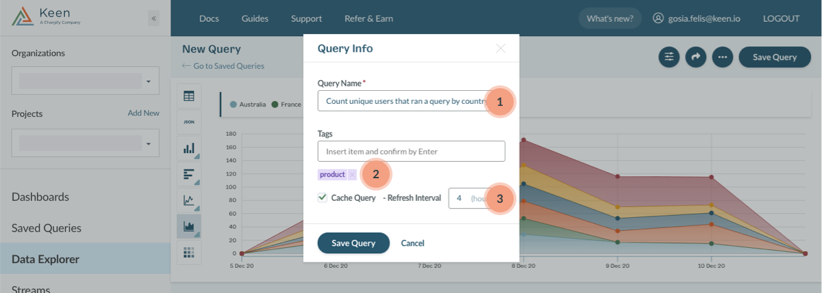
After clicking “Save Query” you will be prompted to give your query a name.
- We recommend naming it something descriptive like “Count unique users who ran a query by country” so that it’s easy to identify.
- You also have the option to add tags to your saved query to keep organized.
- We recommend caching high traffic queries with a refresh interval that is acceptable for your application. In this case, the query would only run once every 4 hours, significantly reducing your query volume and helping you stay under your plan limits.
To save the query, select “Update settings and save query”. Once you’ve successfully saved a query, you can use that query to create a Dashboard.
Step 2: Add your graph to a Dashboard
Select the “Dashboards” tab and you will be taken to our Dashboard Creator tool. To start, click the “New Dashboard” button and you will be taken to the dashboard edition mode.
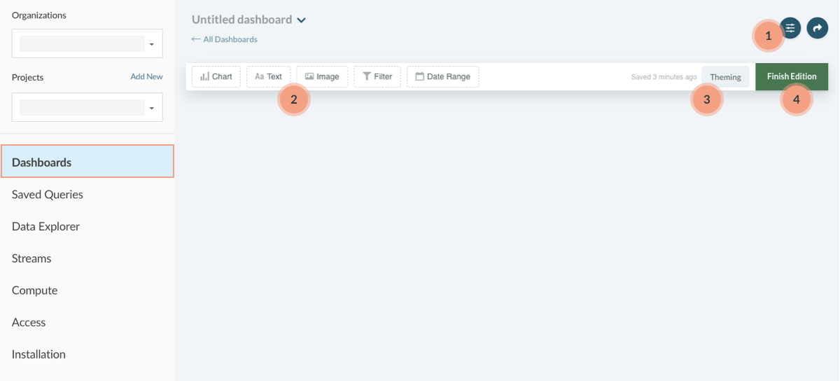
In this page you can:
- Give your dashboard a name and add tags.
- Choose which saved query you want to visualize on your dashboard. To do this, drag and drop the “Chart” widget to the dashboard area and select the saved query. You can also add other widget types to your dashboard.
- Customize your dashboard using the Theming options in the right-hand side of the edition bar.
- Once the Dashboard is to your liking, select “Finish Edition”.
Learn more about our Dashboard Creator:
Make sure to share your work with relevant stakeholders by downloading an image, embedding the HTML snippet, or snagging a shareable link. In addition to using Keen’s Dashboard Creator tool, you can also create custom visualizations with our Data Visualization Library! Happy Exploring!
