2019 was a fantastic year for Keen. We loved helping so many of you harness the power of data to create value for your end-users and customers. We are proud of the way our team embraced the challenges of modern-day data visualization, and we look forward to enhancing our platform even more in the new decade.
As with any journey, we wanted to pause and reflect on where we’ve been so that we can better understand where we’re going.
Over the past year, we:
- Empowered over 400 new clients with event data streaming and customer-facing metrics
- Dove deeper into the global startup community and participated in conferences like Techday LA and Techday NYC
- Almost doubled the size of our team and increased our capacity to support our clients
And these are just a few of the highlights.
Below is a recap of the new products and features we launched to enhance the overall Keen user experience. We also wanted to share the insights we heard from industry thought leaders in 2019 and provide a teaser of what we have in store for 2020.
2019 Product Highlights
Improved Data Visualization Capabilities
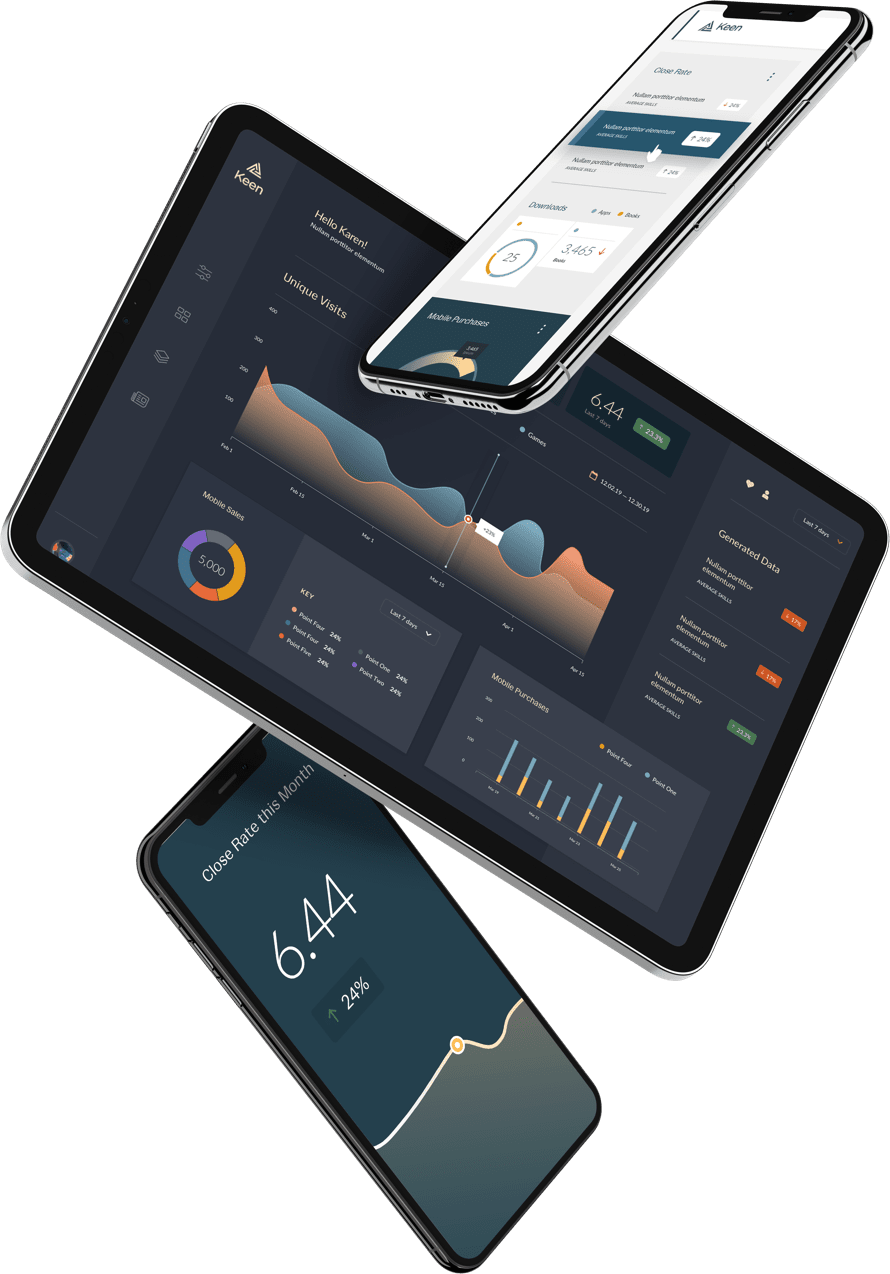
This year, we focused on building tools to simplify the art of data visualization. We wanted to help our clients create clear and compelling charts with clicks, not code.
In Q3, we deployed two game-changing tools. Our new drag-and-drop Dashboard Builder is designed to help users create custom reports, charts, and graphs within an easy-to-use interface. Our new Theme Builder allows clients to generate design palettes for data visuals that align with overall branding.
We also created new chart types that represent certain datasets more effectively:
- Choropleth maps
- Funnels
- Heatmaps
Users can also now download any charts that they create within Keen as image files (JPEG and PNG). With these updates, we’ve made it easier than ever to build and share data visualizations that are created with Keen.
Enhanced Processing & Computing
On the computing side, we made several crucial back-end updates to our platform.
We launched a Regex filter in Q2 so that Keen users can now run complex searches on property names. The new filter will save our clients thousands of hours of parsing through large datasets, especially those involving lots of text.
We also made it easier to work with Cached Datasets to improve query efficiency and search speeds. We realized that long loading times can hurt the user experience significantly, no matter how beautiful the final data visualizations and customer-facing metrics may be.
Better Integrations
Additionally, we integrated Keen with Chargify, a complete billing solution for SaaS products. In the past, we used a custom system to manage subscriptions and billing plans. We realized that we weren’t giving our clients the best choice possible on this front. Chargify simplifies billing dramatically and allows teams to track usage details easily.
Looking Ahead to 2020 Products & Features
We already have big plans for 2020. Next year, we will give our clients even more flexibility over the design of their dashboards. Thanks to the feedback we received on the beta version of our Dashboard Builder tool, we can create new, improved tools that directly address your concerns and needs.
We’ll also invest further in advanced programming functionality. We recognize that features, such as secondary and join indexes, will be valuable in the future as client data becomes more complex and nuanced.
Our product UI remains a top priority for us going into the new year as well. We continue to be passionate about empowering our clients to deploy the best possible data visualizations for their internal needs and end-users.
We are also keeping a close eye on new industry trends and regulations, such as the California Consumer Privacy Act. We want to assure you that Keen is fully compliant with the legislation so that you don’t have to worry about how your customers’ data is being handled.
Building Up Data Design Best Practices
We spent a lot of time this year studying industry trends and learning from other thought leaders in the product analytics world. Our team learned a lot about data design best practices that we are excited to share with you through educational resources, newsletters, and blog posts.
Data Design Accessibility
Accessibility is a hot topic in the data design space right now. Mobile usage is skyrocketing, which means online applications and platforms must be built with responsiveness in mind. We worked hard this year to ensure Keen is optimized for any device. From desktop to mobile, our clients can deploy beautiful and clear data visualizations to end-users directly through the front-end experience.
We also grew more aware of the need to support data design for users with disabilities and diverse backgrounds. Designers should strive to create charts and graphs that any audience can interpret accurately at all times.
Conversations with other Industry Professionals
We were fortunate to have many enlightening conversations with data design experts on highly relevant topics.
Ash Shih, an engineer-turned-designer, emphasized how important broader context is when creating data visualizations. Through his work, Shih prioritizes visual clarity and technical proficiency. You can’t optimize data visualizations for others if you don’t understand the information yourself.
Joe Preston of Quickbooks reminded us to build applications for the customer, not for the expert. At Keen, we recognize that many of our users aren’t software engineers and statisticians. Therefore, we design our UI to be engaging for all skill levels.
Hem Patel at Signal Noise emphasized the importance of understanding the needs and end goals of target audiences. Data visualizations and customer-facing metrics are only as valuable as the actionable insights they produce.
Silvio DaSilva from Moody’s Analytics highlighted that data design is as much an art as it is a science. Audiences are unique. Businesses are different. The best visualization for one situation may not be the best for another.
New Resources
We published several ebooks to help others understand the unique challenges associated with data reporting and visualization. Feel free to download and share the following resources:
- 8 Ways to Utilize Customer Facing Metrics to Drive Product Success illustrates some key ways to use data visualization to improve your product
- The Book of Really Good Metrics covers common chart types and best practices for the type of data they are best suited for.
- Data Visualizations that Pop dives into design best practices across fonts, colors, and more so that metrics are effective and easy to read.
Client Success Stories
One of the best parts of our jobs is hearing how we help our clients grow and succeed.
This year, Groove was able to launch a comprehensive suite of reporting tools with help from Keen’s platform. Now, Groove’s customers have access to a plethora of valuable data points and metrics directly in the platform without having to manipulate any data themselves.
Content Science differentiated its services even further with Keen’s help. They built a new solution that captures key customer behavior data and generates reports, all through the front-end experience. The Keen platform enabled them to get to market quickly with their new product ContentWrx and accelerate their growth, increasing revenue by 20% in 2019 alone!
Thank You!
We wanted to extend a huge “thank you” to all of our clients who have helped develop Keen into what it is today. Without your support, feedback, and collaboration, we wouldn’t be ready to tackle the next decade with us much confidence or sophistication. We look forward to building on our relationship even further in the coming year! To stay up to date, we invite you to join our Keen Community Slack or subscribe to our newsletter!
Stay tuned for future community engagement opportunities and new product features. There’s a lot coming – see you in 2020!


