According to SimilarWeb, there’s a 58% chance that you’re reading this on your phone; that’s the rough estimate for site visits from American mobile devices in 2019.
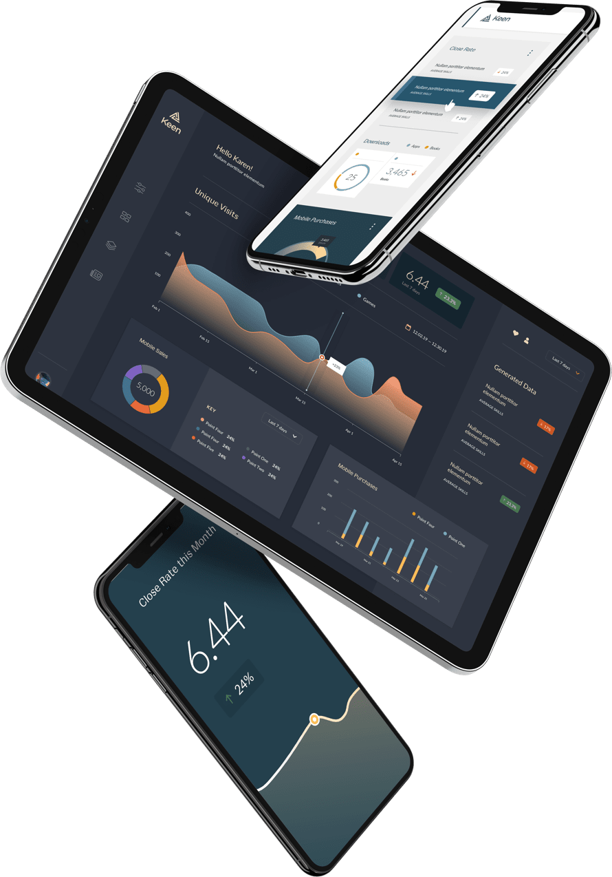
And yet, developers in every industry are still playing catch up to optimizing experiences for mobile. Data designers are not excluded from this, as everyone’s trying to figure out how to communicate complex information clearly in less than 4 inches wide.
So, we did some research. Here are a few tips on how to showcase data, especially for mobile.
Don’t Retrofit Desktop Data onto Mobile Designs
Instead, design with mobile in mind from the beginning. “Don’t copy and paste from desktop,” says Dvir Magal, senior product designer. Rather than creating a wide bar graph first for desktop, and then having to make each bar infinitely narrow to accommodate for a narrow screen, consider a different visualization altogether when embarking on mobile design.
For example, say you want to capture and communicate temperature data. On desktop, that might be done with a line graph. On mobile, you’ll need to use big text and thick lines in order to create even more visible contrast and simplicity in a small space. That might mean just using simple numbers and limiting the time expanse the visualization is covering (i.e., report temperatures of the last three days, not the last seven).

In addition to the design itself, keep in mind the limits of mobile functionality. Tooltips, for example, are nightmarish on mobile because they’re built to appear when a cursor hovers. Without that feature, users may not realize they exist. Additionally, they’re often small and can make it difficult to navigate the chart.
Utilize the Benefits of Mobile, such as Geolocation
While mobile has its limits, it also offers great capabilities that desktop does not. Geolocation is the most obvious, where data could automatically build or display information by collecting where the user is (or, at least, their phone). If you’re working with maps, you can provide them with local data, and they can zoom out if they need to.

The Los Angeles Times created a great example of this, visualizing water main leaks across Los Angeles and allowing readers to input their address on desktop to see the leaks closest to them first. On mobile, geolocation could be automatically implemented.
Display Real-Time Data with Statement Numbers
Because mobile is so much smaller than desktop, at the end of the day it can be difficult to convey an entire trend on a little screen. Key indicator numbers make a big statement on an idea, even if it may mean giving up the communication of nuance over time. That may sound contradictory, but here’s the tradeoff:
For the most part, apps and phones are built to relay information that pertains to the user’s lived, personal experience in real-time. For example, visualizations that display workout stats, the weather, or a navigated route directly relates to the user at any single point. Therefore, bold numbers that display a data point at one point in time, such as the temperature outside at one hour or calories burned after one workout, are effective. Whereas on a desktop, a user can stop, sit, and reflect on trends and progress, their phone is a tool to check what’s happening now, as it were. Take advantage of that as a designer, particularly when curating the information you’re choosing to present. It’s a mobile devices’ ability to be a part of the user’s lived experience in nearly any activity in life, unlike a desktop, that makes it so groundbreakingly successful and data so exciting.

This is a strong example of prioritizing statement numbers. While a desktop might show the steps over a map, this display prioritizes simply the number of steps taken in one day’s workout.
So, while it’s important to include some basic data points, stick to the here and now with direct, bold, and time-sensitive information for the user.
In order to do this, it helps to start off with the right tools to enable the best mobile UX build. To get started for your next mobile-first viz, check out our demo today.
