Last month, famed data viz blog Storytelling with Data profiled the work of an unknown, young engineer-turned-designer, Ash Shih, praising him for his unconventional use of the pie chart. They used his visualization of music sales over the last forty years as an exception to the no-pie charts rule that most data visualists favor.
We wanted to learn more about Shih, about how he as a relatively new designer with no formal design training chooses to build his acclaimed visualizations.
Shih began his career as an engineer, running technical analyses on radars and missile technologies for Raytheon, a weapons and missiles manufacturer and contractor. While there, he began dabbling in the creative side of data analysis, building his Tableau Public profile originally for recreation. He began participating in the #MakeoverMonday challenge, where designers take a clean data set among a range of categories and compete to make the best viz. He also started participating in the challenge’s accompanying webinar, where creators could get feedback on their work. By working in this space more frequently, Shih wanted to make the official transition in his career to reflect his talent and passion for visualization.
This year, Shih transitioned to working at Illumina, a biotech and genetics firm that provides the technology to sequence genetic samples, working as a contractor with companies like ancestry.com and 23 & me. Illumina also runs analyses to help hospitals and researchers identify genetic diseases. As an analyst, Shih largely visualizes financial data as it relates to product offerings, to help upper management make investment and spending decisions.
Shih offers some tips on how he as a budding professional designer utilizes and designs for clear, effective communication:
Data Visualization is All About the Context
When sitting down to begin a viz, Shih says that the first step is identifying the context for the data. That means assessing the type of data and figuring out the optimal display for it visually, which can be based on how clearly and comprehensively the info can be displayed, the amount, spacing, and the category. Shih explains, “a time component is usually a line chart or area chart. Bars work too. If you want to use more ink and make it stand out then use bars or if you want to save space and annotate something then lines work well because then you have all this extra white space to annotate the line itself. I tend to like horizontal bars because labels fit very well – you can fit the labels in the bars.”
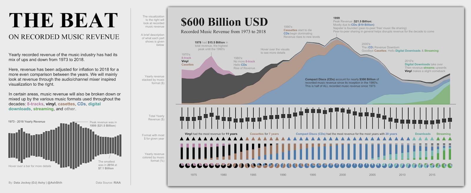
That said, as in the case with The Beat on Recorded Music Revenue, his visualization he created for the #MakeoverMonday challenge mentioned earlier, Shih created a visualization that physically looked like a mixing table at a recording studio. His unconventional use of a row of 45 pie charts to represent each year of shifting sales (among records, CDs, tapes, etc.) looked like turning knobs of the table. To offset the poor clarity that had in actually conveying the data he also included bars above it (designed to look like columns on the table) that displayed the same shifting sales data more clearly.
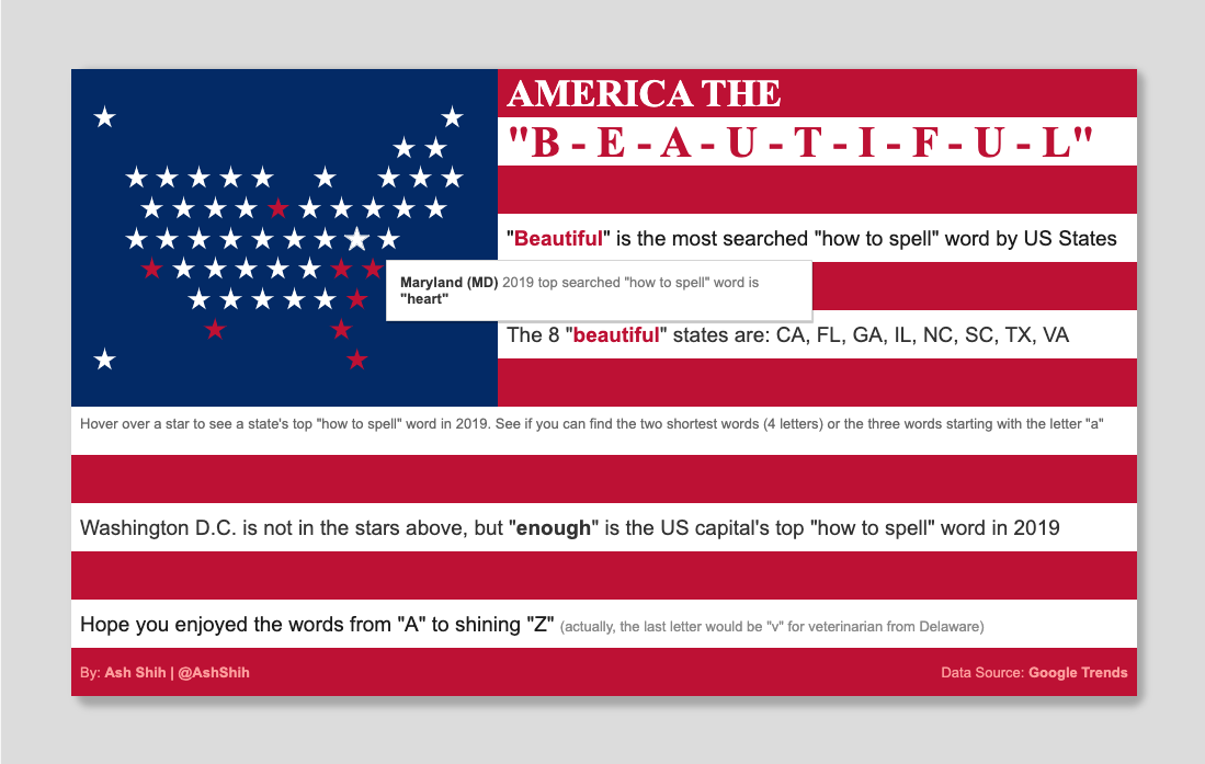
In another themed viz displaying what words Americans Google how to spell by state (based on the most popular “how to spell x” searches), Shih represented each state with a star formed in the rough outline of the US map, and users could hover over each star to see which word was the most Googled in that state (most common across the US was “beautiful”!)
When to make a “self-serve viz” versus an explanatory one
Key to his work at Illumina, explains Shih, is receiving data sets gathered by the financial and product sides, cleaning and sorting through it, and creating a neat viz. At work, he explains, because the other departments collect the data and are familiar with it, his job is purely visualization, not necessarily curation.
He explains that “at work, I create mostly business dashboards that have five to ten filters, where the user wants to manipulate and choose the things they see. It’s self-serve.” When it comes to Tableau or editorial work in general, though, Shih says, “I choose a story and figure out how to tell it.” He continues, “I would imagine there’s more explaining to the audience. You have a more targeted audience who you have to tell a very guided story, and that’s where explainers are really useful. That takes finding something interesting in the data set and figuring out the best way to make those messages pop out on the explanatory side.”
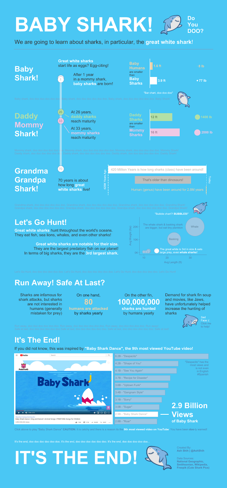
It’s clear that Shih employs the heavy explainer technique, especially when gathering his own data sets or visualizing outside of the Makeover Monday datasets. For example, Shih found great white sharks interesting, googled a ton of facts, and created this popular explainer viz on Baby Sharks.
Technical Background Comes First
As a representative of an amateur designer turned professional, Shih relies on his quantitative background in engineering and data analysis for his work. In speaking to the transition from analysis to visualization, Shih says, “Most of my skills from that are being comfortable with the technical side of things. I coded while I was working at Raytheon and handling data, so that wasn’t a big hurdle when I jumped onto the data visualization side of things. Without that, I don’t know how I could have transitioned this quickly.”
Point being: while lots of graphic designers do great work, it takes a deep understanding of a data set’s nuances, which mostly requires a technical statistical skill set, to be able to effectively visualize that data in the most unique, creative, and comprehensive way.
For those exploring the intersection of the two, whether a data scientist or designer, there’s tooling to help you work out the side less familiar to you. Check out our demo to see how you can add data visualizations that your users will love, too.


