If you’ve ever been to a European football game, you’ll recognize that unique brand of fervor fans have for their home team, one that pales American soccer into a little league game with comparatively deflated cheers (American football, though, different story). In that European spirit, Munich-based tech conglomerate Siemens built a project celebrating its home city’s undying commitment to the FC Bayern-Munich Football club. They retold the story of the game, with cheery passion and all, with their own, uniquely innovative twist.
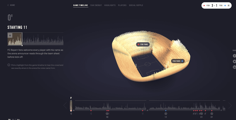
Together with The Economist Group, Siemens commissioned “Reimagine the Game”, a project that visualized key moments in the 2018/2019 Munich Bayern season as told through the fan’s reactions. The project collected and visualized sound volume data from five matches, transforming cheers, boos, and every other holler you might imagine were bellowed out at a sloshy German soccer game into ordered, sonic valuations. They digitally rebuilt the Allianz Arena, Bayern’s home field, creating an interactive stadium through which users can now rediscover momentous plays, their favorite players, even detested ref calls, through the lens of audience reactions.
Today, though, we are celebrating the visionaries behind the project: a small but globally-renowned data design agency called Signal Noise. Founded in London in 2010 by Hem Patel, Christian Thümer, and Matthew Falla, the agency began by working on a slew of digital services until ultimately deciding to hone in exclusively on data-based projects, including both software products and content. In 2016, the company became a subsidiary of The Economist Group, which led to its work with Siemens, an Economist BrandConnect client. Attesting to their unapologetic innovation, Signal Noise develops passion projects that are held in annual exhibitions, covering topics such as the gentrification of London or the filtering and refraction of information online. They’re not unlike what you’d see in New York’s Chelsea Art Galleries, stopping people on the street with no background in data viz all the time.
We spoke with Hem Patel to get some insight on how publishers like Signal Noise and the Economist Group transform data into innovative, communicative art, and how communicative data visualization will transform in the future.
Patel’s key insights, delivered with a humble confidence that inevitably accompanies a decade of trailblazing design work, neatly align with the three steps he listed in Signal Noise’s process. He defined them at our conversation’s onset: Understanding what the goals are, validating what the needs are, and making sure the output is feasible from a technical and design point of view.
We’re breaking that down, because at the core, Patel shares the secrets that decide the success, impact, and value of any viz, whether for product or communicative publishing.
1. “Understanding What the Goals Are” Means Know the Point of Making a Viz At All
At the end of the day, Patel explains, a visualization will have only been worth its weight if the ultimate point of creating it–the challenge–was met. That challenge could mean achieving an ROI for a brand at a publisher; it could mean helping a cybersecurity firm see threats in real-time; it could mean helping soccer clubs better capture their own ROI on player trades (Signal Noise has built projects that do all three).
“When we’re working in the context of the Economist group, the ROI for them is the KPIs–clients want to see eyeballs on it,” he told us.
While there is a growing opinion among data visualists that creativity is limited by the increasing need to design for KPIs, Patel disagrees. In fact, he says that at the beginning of a project “it’s good to know what those [KPIs] are, because…it helps focus and shape what you do and helps you know that it’s relevant to that audience.”
That said, he explains that if you’re measuring a visualizations’ success based exclusively on eyeballs on the work, which most publishers do when assessing the success of a campaign, then he urges you to really think critically about the initial goal: If ROI is the measurement for a campaign’s success, then audience engagement is a better proxy for it than impressions, or eyeballs, alone. In the Siemens Reimagine the Game example, the data viz had an average of 2.1 page views and 277k interactions with the data tool. That insight is more valuable than the 61k unique visitors (although that’s nice to have too). Think critically about the challenge and how it translates to a goal, Patel says.
For Reimagine the Game, “The challenge was, How do we excel in the partnership between Siemens and Bayern Football club? From Siemens’ point of view, it was to connect with the fans [a goal captured by impressions and engagements] but also to change the perception that they don’t just make fridges.” For a while, he explains, Siemens has worked in BioTech, IoT, and healthcare, and “so we wanted to use their tech in the context of the partnership of excellence on and off the pitch. So we pitched to them the notion of ‘Well, what if we watched the soccer game where you didn’t watch what happened on the field, but you listened to the crowd; is there any correlation between the noise and what happens in the game?’” The acoustic cameras, he said, were originally used to detect faults in car engines, and were thus designed to detect minor sounds. “We put one on either side of the stadium and we captured the game through point cloud data. Then that was put into generative code, so we made the stadium 3D.”
Imagine “trying to explain this to a client,” he says, “and they’re like ‘Well, what is this?’” In that case, understanding their ultimate goal from the onset was really important, because the job of Signal Noise was to achieve the intangible goal–that of redefining the perception of Siemens– through a tangible visualization. Their pitch to Siemens at the onset ultimately demonstrated that they understood this goal.
“It was a big step for them to trust us to go out to Germany and do this. And it worked. We captured five games, and the project went on to win a number of awards. It has been one of their most successful campaigns,” he said.
2. “Validating the Needs” Means Get To Know Your Audience Really Well
Here, Patel expands on the notion that winning visualizations are those that proactively gear up for healthy audience engagement, not just eyeball views, by understanding thoroughly who you’re talking to before designing the viz. Patel offers some guidance into how they break down audience assessment at Signal Noise:
“For me, Signal Noise and our audiences fall into three buckets: the skimmers, wavers, and divers.” The skimmers have little time and want to get the story’s highlights, he says. The wavers want to understand the context. And finally, the divers are those who interrogate the data and information and want to draw their own conclusions.
In other words, if the goal of the project is to generate positive ROI among a publishers’ audience, then the task boils down to nailing the right visualization for that project’s unique audience. This can only be accomplished, says Patel, by having a comfortable understanding of how deeply that audience was going to engage from the get-go. If you make a complex interactive piece for skimmers, the ball may not stick and the engagement not turn out to what you hoped.
“So KPIs are one thing,” he concludes, “but it’s also about understanding the audience and what is relevant at that time and to them.”
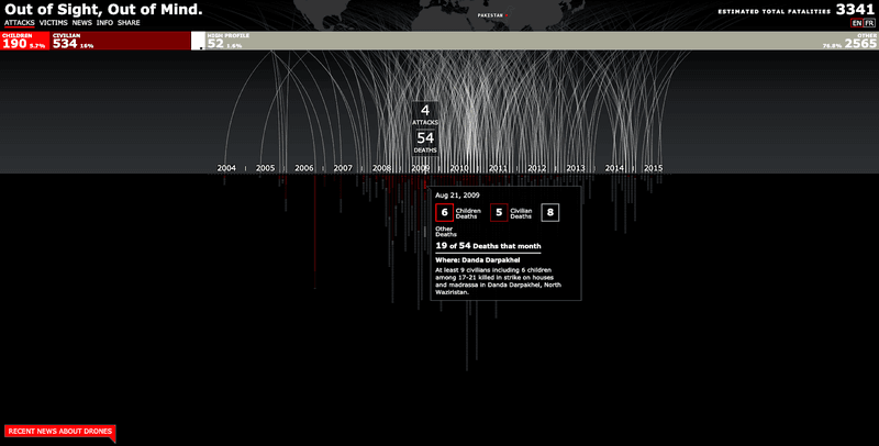
A strong example is that belonging to Wesley Grubbs, Patel says, the CEO of data viz studio Pitch Interactive. In 2013 Grubbs made a project called Out of Sight Out of Mind, which visualized the impact of drone attacks in Pakistan from 2004 to 2015. The viz included a time-lapse, where the user could see the bombs being dropped and the ensuing devastation. “From an editorial and storytelling point of view,” notes Patel, “that is emotional and very powerful. You can list how many bombs were dropped, but when you add that context, when you see the motion and add sounds, it gets really emotional.” In this case, if the audience is coming for visceral, real image of what’s going on in the world (as in the case of news readers), Grubbs’ visualization fits the bill.
3. “Making Sure the Output is Technically Feasible” Means Figure Out Your Data’s Potential Early On
Before Patel’s team agrees to sign on with any project, whether with a client directly acquired through the agency or through the Economist’s BrandConnect studio clients, Signal Noise first judges the data set itself to determine “what is possible and what is right. Without doing that we don’t commit,” says Patel.
Specifically, this means assessing whether the nature of the data sets lend themselves to creating a value-add, impactful visualization because not all do. For example, sometimes a simple bar graph is the most effective, impactful way to communicate insight from a given set of data. In a case like that, bells and whistles to the visualization won’t compensate for either straightforward insight or lack of impactful insight altogether. On the converse, a complex data set can only be effectively communicated with a carefully and thoughtfully designed viz. Patel explains:
“If [the data set contains] a wealth of information, something static isn’t going to work. Motion might play a part, maybe a series of short animations. But do you want someone to be able to pull a lever to the right? If so, what’s the impact of that? If you pull it to the left, what’s the impact? Do you want someone to interact with the visualization? What do you want them to go away with?”
Patel uses Signal Noise’s collaboration with the British Beer and Pub Association as an example of this stage in the process. He explains,
“They wanted to create awareness around the impact if the Chancellor raised the price of a pint. So we created a very simple visualization of a red briefcase, and if you moved it one way you could see in your district or council in the UK the price of a pint, how many pubs would close and how many jobs would go out if it were raised. The CTA there was once you selected your council, it immediately pulls the Twitter handle to that MP.”
In this case, even though the data set wasn’t terribly complex, Patel’s team understood early on that its core insight–how artificial price increases can directly result in job loss–were not only impactful but actionable. Simple, static vizzes couldn’t achieve the communication of impact or allow for the interactive, actionable aspect, and so the viz made an impact. “They haven’t raised the price in three years,” he said with the crack of a smile. “It’s like a lobbying tool.”
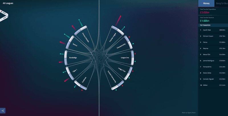
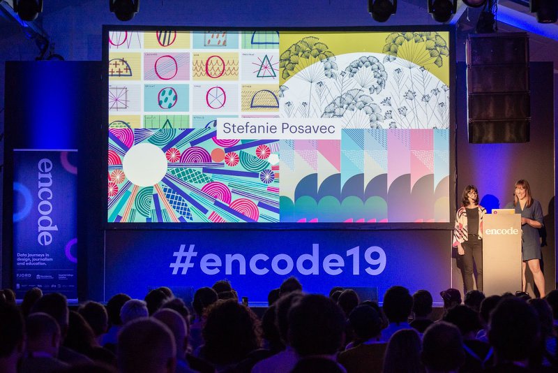
In addition to all of Signal Noise’s prolific client work, Patel and the rest of his team regularly nurture and build out huge passion projects, making their development core to Signal Noise’s corporate culture. Operating with the conviction that these projects fuel creativity for client work, the team commits to building their own digital visualizations as well as physical data installations, which have been exhibited annually in London for nearly a decade. One such project is TransferWindow, mentioned earlier, a product platform that enables managers of Football Clubs to analyze past player performance against the price paid for them, and predict future valuable trades using a tool-tip filter-enabled web. They also built the Gentrification Forecast, a visualization over time of changing neighborhoods in London, including historic events that led to disruption in particular areas. He also spearheaded Encode, a data design conference held for the first time this past September at London’s Design Festival that drew together leading minds in data visualization, education, and journalism.
When asked about the future of this work, Patel attested to the innovative perspective from which he and his agency will continue to operate: “no matter what, we will always reinvent how people see data.”
Ready to start putting your data to work? Contact us for a free demo consultation.


