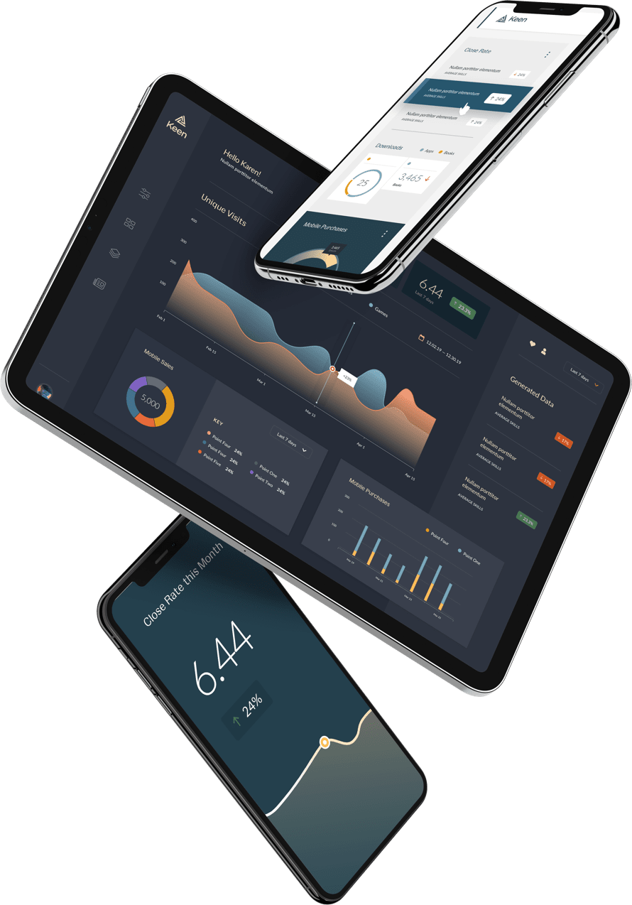
As data visualization enthusiasts, we’re excited to see radically creative ways designers are innovating metrics reporting.
But as we look toward their advances, it’s also worth remembering why computerized data vizzes were developed in the first place: to visualize information that can make or break a business. Specifically, metrics reporting was born out of a fundamental economic need for small businesses and their accountants to track sales, incomes, and expenses more efficiently and accurately. Today, that has evolved into accounting softwares like Freshbooks, Xero, and Sage Interact, each in a race to iterate their user experiences better and faster.
But, one tool out-paces every other, leading the market by a landslide: Intuit’s Quickbooks.
According to various reports, Quickbooks enjoys somewhere between 75-80% of the accounting software market share in the US.
As a team of people passionate about user design and metrics reporting, we wanted to understand what about Intuit’s tools over 29 million small business owners across America love and trust so much. We sat down with Joe Preston, the Design Director of Quickbooks US, to learn about how his team conceptualize design challenges and what tips he has for today’s platform UX designers.
Here are a few highlights, perfect for every dev team implementing quantitative reports.
1. Design for the customer, not the expert.
The key to good design, Preston says, is understanding and optimizing the usability based on the skill set and knowledge of the primary user. For Quickbooks, that means designing for the smalls business owner, not solely their accountant.
This is best exemplified in the “Reports” section of Quickbooks, Preston explains, where a user can see sales, income, or costs based on a specific project or in the overall business. There, much of the ledger information is organized into simple text tables.
While this simplicity is great for an accountant who might have to present the data according to government guidelines or otherwise very straightforwardly, it’s less productive for the business owner.
Preston believes that such information should be presented in a much more intuitively digestible way for those without extensive accounting experience. He believes opportunity where visualization can truly enhance the data exists in reports that show outliers, trends, and comparisons to other things, especially over time.
Although Quickbooks’ Reports section is still table-based today, Preston is leading his team to redesign the section to make it more customer-friendly. That’s because “the way a small business-owner wants to see things,” says Preston, “is very different than how an accountant wants to see things.”
2. Be proactive with data.
Not only is it imperative to display information aesthetically-well and intuitively, but Preston takes this insight a step further: Customer-centered visualization is about giving customers information before they would even think to look for it, he explains.
Today, Quickbooks is investing heavily into figuring out how to deliver information to customers proactively. Visualizations that depict how balanced a customers’ books are, where they can cut costs, and how to more efficiently categorize expenses are examples of proactive design, says Preston.
It’s at that point that Preston believes the design teams’ role is paramount. He says a UX/UI team transforms from a user-centric one to a customer-centric one when it not only displays information cleanly and neatly, but thoughtfully prioritizes the right information that customers need the most.
If a customer wants to get organized and get insights, and if it means “having to go to the reports section and having to click on some buttons and generate stuff that they don’t know what it means, then we didn’t do our job,” says Preston.
3. Experiment with traditional taxonomy
In an effort to design for the customer, Preston found that the way visualizations reference terms make a huge difference in how the customer conceptualizes the product itself.
“All you want to know as a small business owner is that you want to get paid faster. You don’t call that ‘accounts receivable’ and ‘accounts payable’, that’s foreign terminology,” he says.
So, Preston calls to designers, rename classic terms. Preston explains that UX developers have the power to“just decide that ‘No, we want to visualize [this data] in an easy to digest manner for someone who knows nothing about accounting’, and have conviction around that.” He believes this holds true for any customer-facing industry, not just accounting or financial technology.
Start by building a viz in “plain English”, Preston advises, and A/B test different names prior to full rollout to ensure intuitiveness and customer-usability.
4. There’s no such thing as an average small business owner.
As a designer, “if you think there’s an average customer with this generic set of needs, you’ve really missed the mark,” Preston warns. “There’s a spectrum of customers and their needs are really different.”
He explains that for Quickbooks’ UX/UI team, many design choices boil down to a philosophical question: “When you design the product, what customer do you pick? Do you pick the very simple customer, or do you pick the power user?”
This debate is exemplified in the Quickbooks’ invoice product, he says, which has loads of customization options for large complex businesses—the “power users”, he calls them— like custom tax rates or unique discounts within one invoice. Overall, Preston believes that an accumulation of small design decisions led to many areas of the product representing this “power user”.
To accommodate for the smaller business with simpler needs, Quickbooks rolled out the “Self-Employed” product, built for the gig economy and freelancers, which has a much more basic invoice.
When pivoting to accommodate for a variety of customers, however, Preston insists that thorough research must be done to establish product-market fit. Attempting to offer a product outside of the team’s primary wheelhouse, or base customers’ interest can lead to product failures and wasted resources.
5. Customer-centric software must be flexible with time.
“As a designer, you need to look at who are your customers coming to you today, and that might be different than your customers who came to you yesterday,” says Preston. “Their behaviors, favorite trends, and what they expect from software, that always changes.”
Preston uses the example of I Love Nail Polish (ILNP), a Quickbooks customer that started selling nail polish five years ago out of their house on Etsy, Amazon, and a Shopify store. Initially, the basic Quickbooks software suited their needs.
Today, they have a massive company with warehouses, factories, and hundreds of employees. The same business that had very simple needs and now has very complex needs, with a full-time bookkeeper on staff and loads of payroll management.
In order to retain the customer, the entire platform—reporting metrics as well as software capabilities— had to be preemptively ready for each stage of customer growth. That includes more complex sales charts based on ever-increasing product categories, payroll upkeep, inventory management, and cost analysis.
In addition to the evolution of individual customers within the business, Preston believes it’s crucial that a design team stay ahead of expectations customers have from softwares in general.
For example, he believes that Amazon set a higher bar for all softwares when they instituted same-day delivery.
On receiving the package on his door step a couple hours after ordering it, Preston describes the experience as “close to magic.”
In that moment,” he continued, Amazon “set an expectation in my brain that I can press a button on nearly anything in my life and it’s convenient and just shows up.”
“Those things happen all the time and that changes what we expect of all of our software to do something like that.”
Wrapping Up
We’re excited to see the new features coming from Intuit’s products, and how financial technology iterates in the way Preston envisions.
For more tips on how to implement customer-centric design, schedule a demo with us to get started with customer-centric metrics.


