Hey everyone! Guest-poster, Nikki, here, providing a summary of a spin around Keen I recently took. A bit about me: I’ve worked in web development, eLearning, and tech training for nearly twenty years. When I’m not making websites, I’m busy catering to the whims of my four-legged boss, Moya, the inspiration for this project.
At Keen, they say you can get up and running with just a few lines of code. To test this out and show you how it’s done, I made a quick tutorial using their AutoCollector to count specific button click interactions on a web page. Keen has plenty of documentation to get started, and I learn best by doing, so I decided to take Keen for a test drive. If you relate to any of that, or you want to see if it really can be that easy to get started, then this tutorial is for you.
Getting Started
All you need is:
- A web page with like/dislike buttons and a counter
- An account on Keen.io
Let’s start with the web page.
Here’s Moya. Each time you click the plus button, that’s one treat. Treats equal likes. (She’s a dog and hasn’t learned how to use social media, so earning treats makes more sense to her than “likes.”) Maybe someone prefer cats or is having a bad day, so they want to click the “minus” button, and take treats and likes away from Moya.
In the screenshot below, you see the number 7, so that’s 7 likes, and now I owe her 7 treats. But from a metrics standpoint, I want to know how many clicks there actually were. Did anyone click “dislike” and take treats away? That’s where Keen comes in.

For this tutorial, I kept it simple. The page is run-of-the-mill HTML with some vanilla javascript for the buttons. I’m also a little rusty with javascript and any coding I need to do that isn’t in WordPress. Luckily, unlike the one other major analytics service I’ve used regularly, I found that Keen has excellent support options where you can talk to real, live people and get to know them by name.
So step 1 is done, I have the web page. The next thing you need is an account at Keen.io. Click the “sign up” link on the home page and create your account. Once you’ve created your account, you’ll get a welcome email with some useful information.
Create a Project
The next step is to create a project from the Apps dashboard. When you create a project, Keen automatically generates tracking code, specific to that project. The tracking code will contain a unique “projectID” and “writeKey” that will be used to collect all the data that you want to track for one project. If you want to read more about projects, you can go here: https://keen.io/docs/access/projects/. Otherwise, jump right in, log in to your brand new account, and create a project by clicking on the New Project button from your home page. (You’ll notice there’s a “Demo Project” in your account to start – you can click on that and take a look around if you’d like.)
For this tutorial, I’m going to name my new project “Give me treats.”

Once you’ve named and added this new project, you’ll come to this screen:

Install the Tracking Code
You can’t stream any data until you have your tracking code installed on your site. From here, click on that big blue button that says “Start Streaming Data.” Conversely, you can also click on “Installation” from your home dashboard. Either way, your next step is to choose your tracking method.
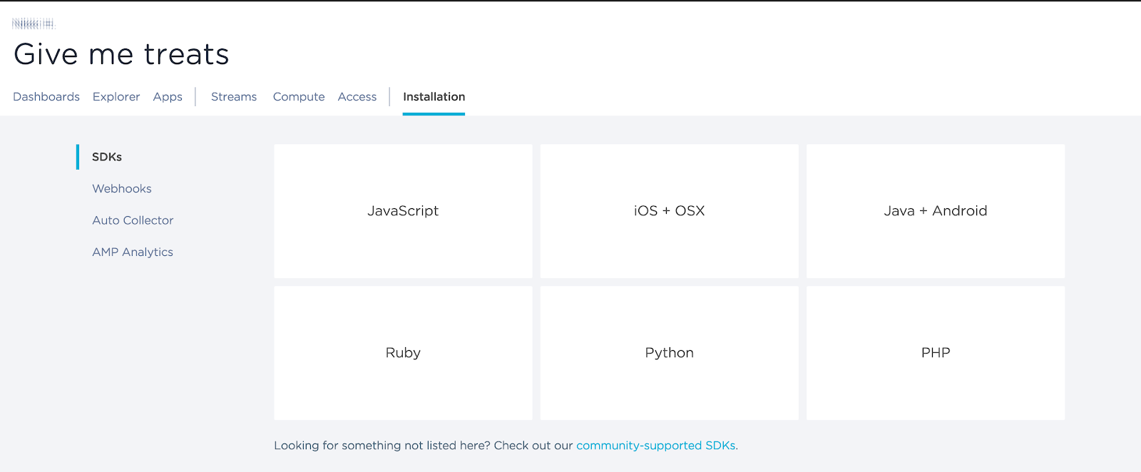
Look at all those options! I’m going to keep it simple to start, and click on “Auto Collector” from that list on the left. If you’ve used any other analytics services before, this is pretty standard – put your new tracking code on your page. (Your projectID and writeKey will not be blurred out, of course.)

Run a Query
We could stop there and start querying by clicking on “Explorer” and running a query such as “count” for the Analysis Type and “pageviews” for the Event Collection (as seen in the screenshot below). When I ran this query, it returned a result of 3. (Normally, a website would have higher numbers, it’s true, but this page was created for the sole purpose of testing.)

Now I want to see how many button clicks there have been, so I’ll keep “count” for the Analysis Type but change my Event Collection to “buttonClicks.” I run the query and get a result of 123.

123 is the total number of times any and all buttons were clicked on this page. But, wait! Didn’t I say you could query to see how many clicks each individual button gets? We’re getting there.
Get Specific
If you remember the screenshot of the web page with Moya and her ball, the count said “7.” That doesn’t mean that the “+” button was clicked 7 times, however. It could mean it was clicked 100 times, and then a cat person came along and clicked the “-” button 93 times. Or maybe someone was concerned about her health and thought 100 treats was too many. I’ll never know. But I can find out how much total interaction there really was.
Here’s the HTML for my buttons. (Sidenote: If you want to try this out yourself, you can hop over to Codepen and download the files for the Pen that I used. I just made some css modifications.) There’s also a javascript file, but what I care about right now are the button ids in my HTML.

You’ll notice three buttons with the ids: “minus,” “plus,” and “clear,” respectively. Remember those.
Now I’ll go back to my HTML file where I placed my Keen tracking code from the Auto Collector. Instead of a general overview of click interactions, I want to drill down and see exactly how many times each button is being clicked. To do that, I added a couple more “record event” lines of script.

Everything up to and including the line client.initAutoTracking is my Auto Collector tracking code. After that, you’ll see the extra script I added for btnClicks. Full disclosure: did I mention that my JavaScript is really rusty? I had some help getting this code in there, so let me tell you again: Keen has excellent support.
Now that those extra lines of code have been added, I can return to my project dashboard on the Keen website. I’ll select my project, “Give Me Treats”, click on “Explorer” and voila! I can run a query with options that hadn’t been there previously.

My Analysis Type is still “count”, because I want to know how many. And I’ll choose the Event Collection of “buttonClicks“ again.
Remember, I added some additional code to my Keen tracking script and now I want to know how many clicks per each of my buttons (plus, minus, and clear). So I’ll move down to the “Group By” drop down menu and choose “domProfile.id.” Do you remember the id tags I pointed out earlier? I have:
button id=”minus”
button id=”plus”
button id=”clear”
Once I’ve selected my Analysis Type, Event Collection, and Group By from the drop down menus, I’ll click on “Run Query” and get my new data.

And there you go. I can see that 75.6% of the total clicks on this page were for “likes” (the plus button). 23.6% was for “dislikes,” and the remainder was the clear button. Notice that the color key in the upper right reflects my button ids exactly. Don’t like colors and pies and percentages? Let’s try viewing the data in a different format. If you look to the upper right of this screenshot, you’ll see a drop down menu that currently says “Pie.” I’ll change that to “Table.”
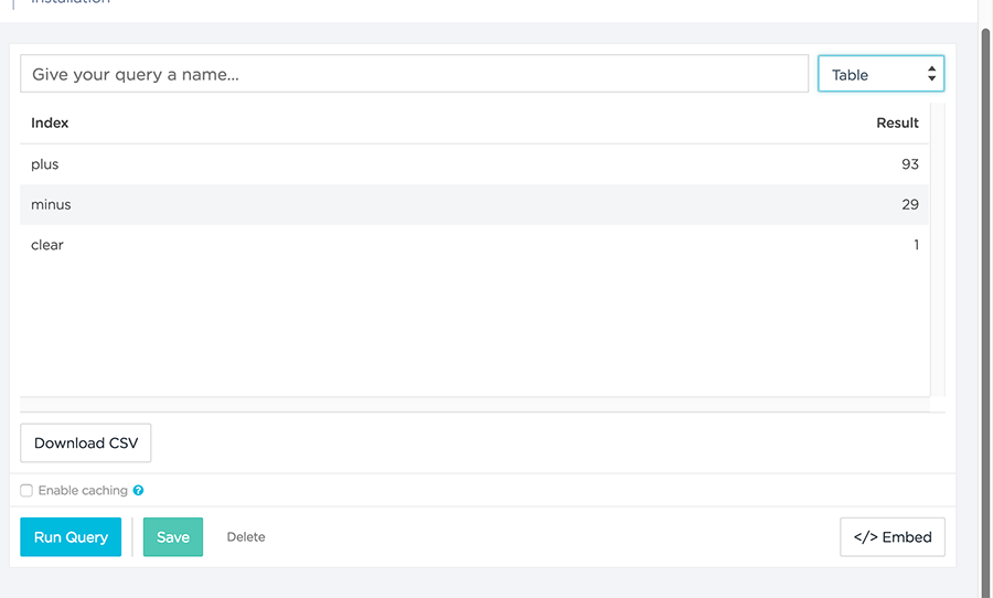
Now I can see actual numbers. 93 “plus” clicks, 29 “minus” clicks, and 1 “clear” click. I could also choose to view this as a bar graph, columns, or as a JSON array. I can also save the query, download the data, or grab embed code to place my data on a web page or wherever I might want it.
Wrapping Up
I develop sites for small businesses. One of my clients releases podcasts each week, which are embedded on their website. Using a click counter, we can collect data on which episodes are being played the most. Once we’ve tracked that data, it can easily be shared with their site visitors and community. Remember that pie chart I showed you earlier? Here it is again, in case you forgot:

We can place a chart made very similarly to this next to the podcasts on their site, where visitors can quickly see which episodes are most popular and make choices about what to listen to first. This could also inspire people who haven’t been listening at all to check out the episodes that everyone else is listening to.
The best part is, the work is already done. All I need to do for them to share this data with their visitors is to click that handy “embed” button on the lower right. Copy the code, paste it on their site, and done.
Interested in implementing customer-facing metrics? Sign up for a demo of Keen now.


