This article was originally published in October 2014 and has been updated.
Building a dashboard for your customers? Need a quick and easy way to share stuff with your team? Check out the new keen/dashboards on Github and get up and running super quick with great-looking, customizable dashboard templates.
Each template is composed of a minimal set of custom styles built on top of Bootstrap v3.2, covering some of the most common dashboard use cases and layout configurations.
Event Data Template Examples
Here’s a template with a line graph, a pie chart, and a row of stacked column charts:
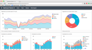
The position and size of each chart is automatically handled by the template. Each dashboard is responsive right out-of-the-box.
There are eight different templates available today. This one’s called Hero Thirds:
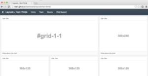
Look familiar? It’s the template used in the example above.
Here’s another one called Quarter Grid:
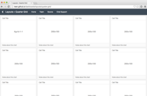
Each container is ¼ of the horizontal space available.
A dashboard template starts out as a set of empty cells. The HTML markup makes it easy to add a chart to each one, along with a title and optional notes.
</div>
</div> </div>
The chart goes in the #grid-1–1 element, embedded directly in the HTML or added with JavaScript later. If this was from the Quarter Grid template, you’d have up to element #grid-1–15 to fill with graphs, visualizations, or anything else you want to show off.
Let’s look at a few more examples of the templates in action. In these examples, queries and visualizations are handled by the Keen IO JavaScript SDK, but you can use any database and charting library you’d like.
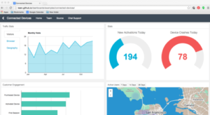
This example is just four large cells. It’s populated with a line graph, two gauges, a bar chart, and even a map:
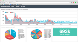
Now check this out: A real live NASA rocket scientist loaded Mars rover data into Keen and a created a dashboard to show when photos were taken. (He even found a 9-year-old bug they’re now investigating!).
This is that dashboard. It has a long line graph showing the weekly count of rover pics, two pie charts about camera usage, and one simple metric — the total count of pics taken.
These templates are designed for elegance and ease. And extensibility too — everything is open source. Hack away.
Ready to get started? If you’re already tracking your data in Keen, it’s as easy as 1, 2, 3:
- Clone the repo to get this sweet, sweet code.
- Enter your Keen IO project ID and read key.
- Add queries and visualizations to each cell. (The Keen IO JavaScript Docswill help you figure out how to construct and visualize queries.)
Get a Keen IO Free Account
If you’re not tracking your data in Keen, you can sign up for a free account, grab your project ID, and start tracking events right away.
At Keen IO, we strive to make data science and custom analytics easier for developers. We hope you find these templates helpful, and can’t wait to see what you come up with yourself!
If you have any questions about keen/dashboards, or any suggestions for stuff we should add to it, feel free to comment below!


