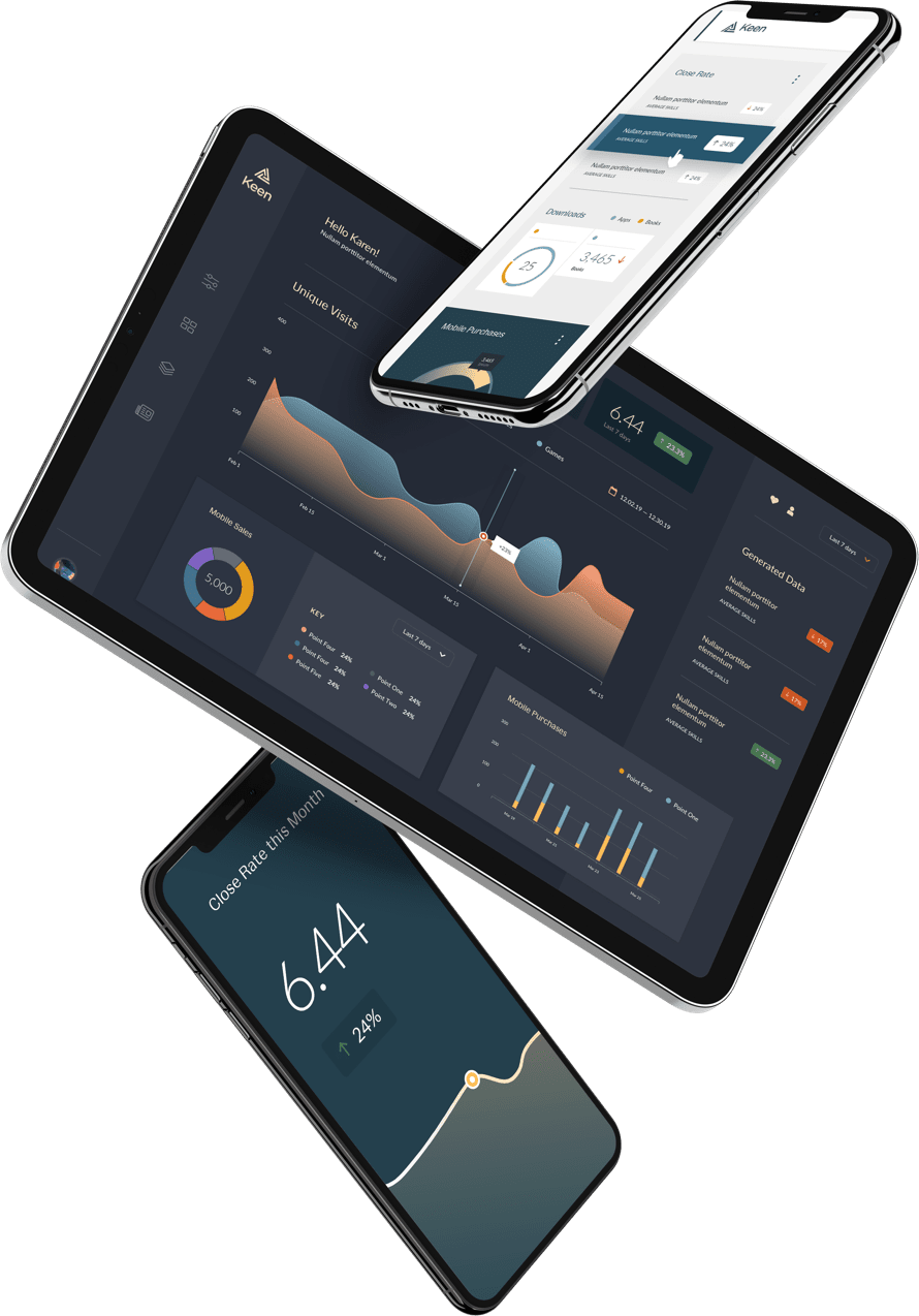
This week, we released Project Analytics — a brand new analytics dashboard displaying service level usage for our customers. This project is the beginning of a new effort aimed at bringing greater insight and observability of Keen IO service usage to our customers. Many of our customers rely on our platform to deliver Native Analytics to their customers, directly in their own products. Now we’re doing exactly that: analytics for your analytics. Pretty meta, huh?
This project was super fun for us to build and an opportunity for us to dogfood our recently released Native Analytics product. Read on for some juicy details on how and why we built this and some of the design challenges we faced along the way.
Why did we build Project Analytics for our customers?
First and foremost, our goal with this update is to improve the product experience by bringing more information to the surface of our web console. We have a clear vision for our apps and interfaces that leans heavily on native analytics powered by our own platform. Account usage information has also long been a common customer request that would land on our support and customer success teams. Baking these metrics directly into the product reduces both support ticket volume for this topic and the time spent tracking down this information for each customer.
This was also a chance to dog-food our own Native Analytics product in ways we haven’t had to yet. The insights we’ve taken from this project have already influenced future product development in big ways, for both our API and data visualization capabilities.
What were some of the challenges we faced while building this?
The design phase of this project was pretty intense! We spent a lot of time sketching and iterating — not just what you see now, but what is coming next. This project also coincided with a substantial visual refresh, several big performance improvements behind the scenes, and an active recruiting effort by the engineering team responsible for building this project. Coordinating a successful release around so many moving pieces proved to be a bit challenging.
These obstacles probably won’t sound too surprising or unfamiliar for anyone reading this; that’s just daily life at a growing company. The experience did reaffirm how important Developer Experience is for API-based services like ours. We put a lot of thought and care into how quickly developers can get up and running with our API and SDKs. We know our customers already have a long list of obstacles and blockers to deal with to get a project out the door. Integrating with Keen and getting data flowing in and out of your app shouldn’t be one of them.
How did we decide which metrics to show?
For this first release, we really had to resist the urge to go big, or to over-commit to granularity or complexity. This is just one small piece in a roadmap that that will unfold over time, and we know we have a lot to learn along the way. We give our customers the same advice: start small and move fast; experiment, iterate, and leave room to be surprised by what you learn. This lets you develop deep understanding and momentum at the same pace. You need both. Having one without the other generally doesn’t work out too well.
What’s next for Project Analytics?
Next, we’ll be diving deeper into project-level usage stats, data visualization, and data management, bringing more information and utility into the web console. Basic usage metrics and fixed dashboards like these are just the beginning. We believe the apps and interfaces of the future will be highly self-aware, educating users about usage behavior and opening up new feedback loops that encourage better decision-making with less effort.
Log-in to your Keen IO account to check out your project analytics or request a demo to get started. We’d love your feedback. Just shoot us a note on Slack.


