In a previous post I wrote, we created a basic example that analyzed earthquakes using the Keen Python Client with Jupyter Notebook. In this post we’re going to be looking at creating visualizations in Python using a visualization library called Bokeh.
Getting Started
To install Bokeh, run pip install bokeh in your shell. After Bokeh has finished installing, open up Jupyter Notebook by running jupyter notebook. In the first cell, you’ll need to set up a Keen Client in Python:
import keen from keen.client import KeenClient
KEEN_PROJECT_ID = "572dfdae3831443195b2f30c"
KEEN_READ_KEY = "5de7f166da2e36f6c8617347a7a729cfda6d5413db8d88d7f696b61ddaa4fe1e5cdb7d019de9bb0ac846d91e83cdac01e973585d0fba43fadf92f06a695558b890665da824a0cf6a946ac09f5746c9102d228a1165323fdd0c52c92b80e78eca"
client = KeenClient(
    project_id=KEEN_PROJECT_ID,
    read_key=KEEN_READ_KEY
)
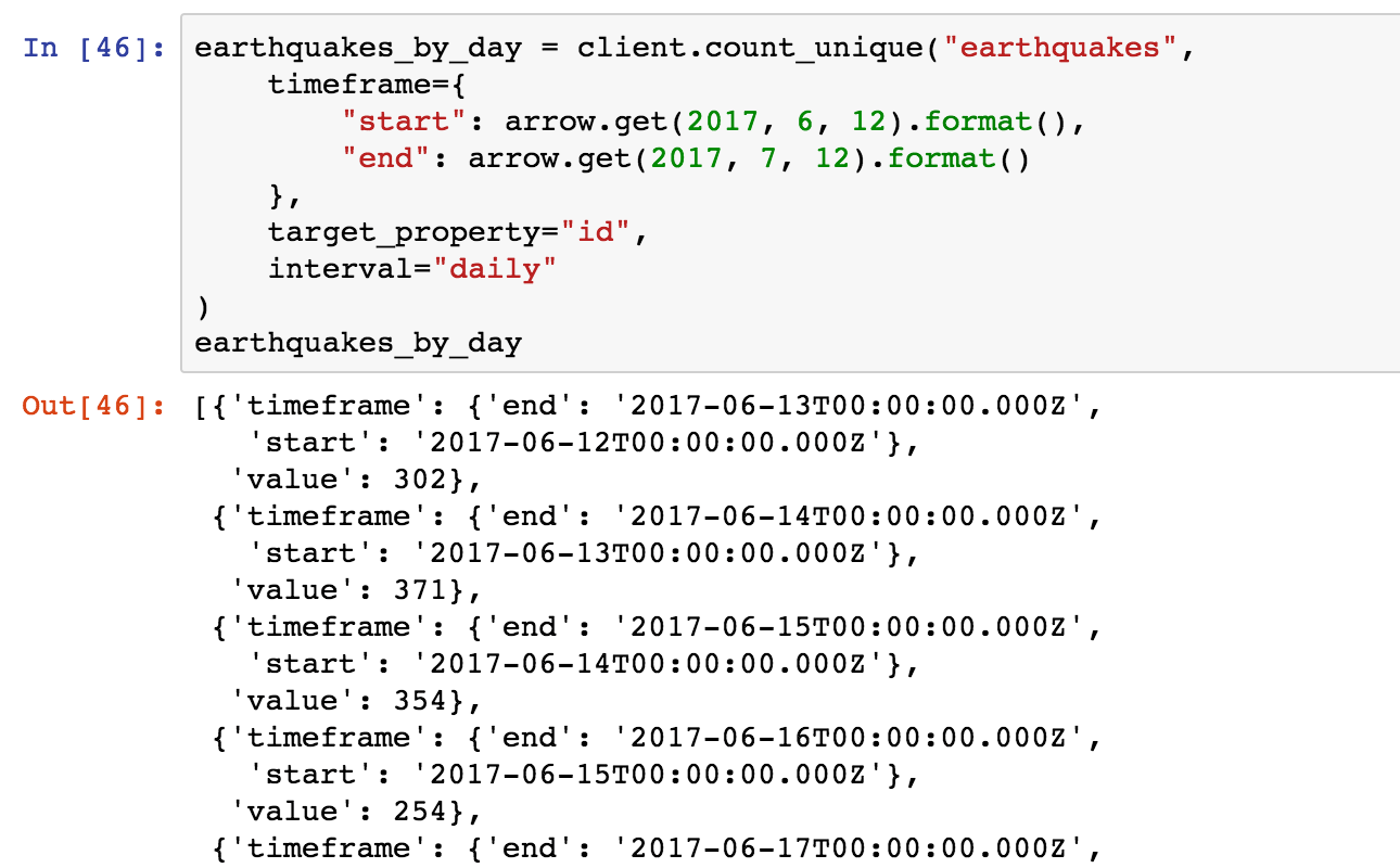
We’ll need to run a query similar to the one we used last time. In the next cell, make a count_unique query on the earthquakes collection with a daily type interval. This will return a dictionary containing the number of earthquakes per day.
earthquakes_by_day = client.count_unique(“earthquakes”,
    timeframe={
        “start”: arrow.get(2017, 6, 12).format(),
        “end”: arrow.get(2017, 7, 12).format()
    },
    target_property=”id”,
    interval=”daily”
)
Let’s import Bokeh so we can visualize earthquakes_by_day. Run the code below in a new cell.
from bokeh.plotting import figure, show
from bokeh.io import output_notebook
output_notebook()
The first line imports figure and show, two functions that will let us plot our data. The next line imports a function called output_notebook. We need to run this method before we start plotting data so our plots are drawn below our notebook cells.
Plot Our Data
A line graph would be a great choice to plot this data. In order to plot this, we need to pull out the number of earthquakes for a timeframe and the corresponding date.
y = list(map(lambda row: row[“value”], earthquakes_by_day))
x = list(map(lambda row: arrow.get(row[“timeframe”][“start”]).datetime.replace(tzinfo=None), earthquakes_by_day))
# Now we can plot!
# `figure` initializes the chart object
pl = figure(title=”Number of Earthquakes per Day”, x_axis_type=”datetime”)
# `line` takes lists of the x and y values and plots.
pl.line(x, y)
show(pl)
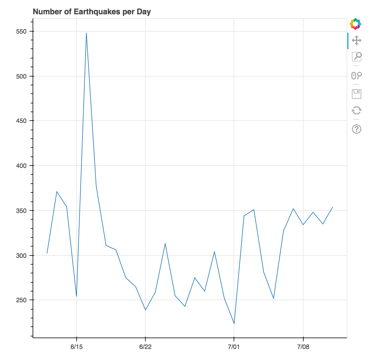
In the code sample above, y is a list containing the counts per day, x a list of the datetime values, and figure initializes the chart object. The linemethod takes x and y and plots those values into a line. show(pl) is the method that actually draws the chart in our notebook.
Customize Our Chart
Bokeh even lets us add tooltips to our charts! We can import HoverTool by calling from bokeh.models import HoverTool in a new cell and pass an instance of HoverTool to our figure object.
from bokeh.models import HoverTool
pl = figure(title=”Number of Earthquakes per Day”,
    x_axis_type=”datetime”)
pl.line(x, y)
hover = HoverTool(
    tooltips=[
        (“Date”, “
{%F}”),
        (“Count”, “
{int}”)
    ],
    formatters={“x”: “datetime”},
    mode=’vline’
)
pl.add_tools(hover)
show(pl)
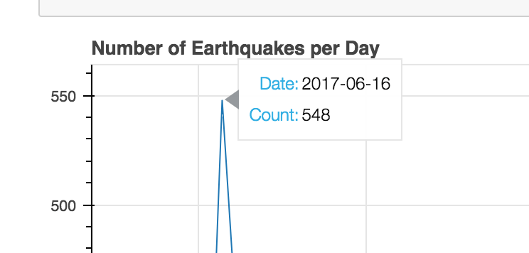
We have to do a little bit of configuration in HoverTool to make sure the tooltips displayed the correct date and didn’t display any values in between the data points (try removing the tooltips option and see what’s displayed). You can check out the Bokeh docs on HoverTool if you want the tooltips to look different.
Notice that there are a lot of earthquakes on 6/17! This might be an interesting place to dive deeper.
We pulled data from a Keen project using Python, drew a line graph for a month’s worth of data, and added interactivity to the chart we drew. The code for this example is available on GitHub. Try playing around with it yourself! If you want to use this example to visualize your own event data, request a demo of Keen and read how to get started!
Next time, we’ll plot the earthquakes that happened in that time period using Basemap and see if we can find anything interesting.


