User research doesn’t need to be a headache. It doesn’t need to be expensive, or time-consuming, or complicated. But it certainly feels that way sometimes, especially with deadlines, competing priorities, or a healthy fear of stasis.
“It sounds great, but we have way too much on our plate to spend time on this right now.”
“I already know what we should do, so why waste time second-guessing myself?”
I suspect the main underlying objection to making time for user research is simply not understanding it. Let’s change that!
This post outlines how my teammate Micah Wolfe and I redesigned Keen’s first-time developer experience during a week-long user research and design sprint. We riffed on Erika Hall’s awesome Minimum Viable Ethnography and introduced a few new tricks of our own. This may not be applicable to everyone –we have an existing product and customer base to draw from– but hopefully you find some of this helpful!
Monday: Prepare
First, I installed FullStory to observe how our customers were already using the current version of our core web app immediately after signup. This part of our site gets a lot of daily traffic from active users, so I added a little logic to only run for those who signed up less than 2 weeks ago.
Next, I scheduled a two hour idea session with 4 colleagues and a whiteboard for the next morning. By the time this meeting rolls around we’ll have made a bunch of valuable user observations and insights, so I scheduled this session in advance to create time and space to process our findings. I also made sure to schedule time before lunch so everyone would be fresh, rested, and focused.
I then messaged a subset of our users, inviting them to share input on something new in a 30 minute video call on Friday. In exchange for their time I offered to throw $25 in billing credits on their account. Soon I had 5 eager participants scheduled across a 3 hour window. It’s best to schedule these sessions 15–30 minutes apart to avoid cascading delays.
Keen has a public Slack community with over 2,000 users, and a metered pricing model that makes it easy to credit customers’ upcoming bills. If this not an option for you, Amazon gift cards work wonderfully.
Next, I shifted my focus internally. Keen has an amazing Customer Success team with a deep understanding of the customer experience, from day 1 to day 100 and beyond. Their input on new product initiatives is priceless. We joined our CS team for an hour-long deep-dive into new account onboarding, asked a few open-ended questions, and took as many notes as we could manage.
Afterward, we debriefed and discussed themes in what we learned. It’s a good idea to do this while a conversation is fresh in your mind. Where are the hot-spots or critical breakdowns? Did we hear anything that surprised us? What do they think are the most important problems worth solving right now?
Tuesday: Analyze
On Tuesday morning I checked out our Fullstory dashboard and found over two dozen new recordings waiting. Each showed a new user exploring our web console in the first several minutes after signup, page by page, click by click. I watched them all and took notes.
Clear patterns emerged that highlight the painful gaps between how we thinkour web console gets used, and how it actually gets used.
Whiteboard time! I brought all of my notes and insights to the idea session that I had scheduled on Monday. In a short amount of time we captured a ton of valuable information, covering a wide range of perspectives.
We all took turns reading through the notes and transferred each point or idea to a magnetic square on our whiteboard. Post-It notes work just as well, if you have them. We mixed and sorted our notes, looking for patterns; rearranging squares into distinct underlying themes, and ultimately finding a fresh new perspective on our first-time developer experience.
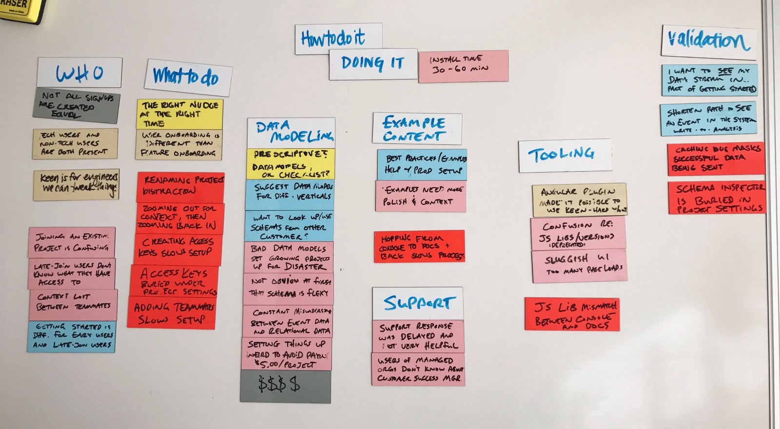
We spent the rest of the day modeling out the sequence of tasks and actions that users go through to get set up, overlaid with the key pain points and breakdowns we uncovered:
- Most of a new user’s first session was spent on things other than installation. Simply getting installed required jumping around several different pages. Sometimes users would get lost and simply give up, or would message support for guidance.
- Verifying that their first integration is working properly is critical step, but our interface actually makes that quite difficult. What turned out to be one of the most helpful features was buried deep in an obscure page. We also found a nasty bug that was obscuring a successful setup for nearly half of all new users – yikes!
Moqups is a great tool for this, but a whiteboard or pen and paper will work just as well. Keep it simple and use what works best for you.
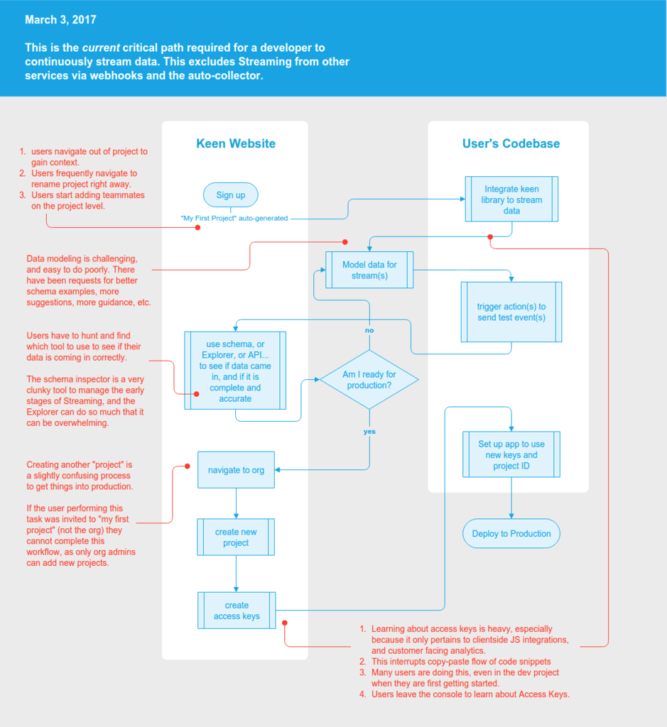
Wednesday: Explore
Day 3 was spent reimagining the critical path of our first-time developer experience. We sketched and prototyped a bunch of possible approaches, refining our thinking down to a new flow that could address all of the issues we found, without being too restrictive.
New Critical Path diagram, by Micah Wolfe (Source)
Thursday: Prototype
We’ve come so far, in such short time! But now, it’s time to put our new insights to work and create something that we can test in the real world. Our efforts from this point on would be based on the following design principles:
- Clarity: Remove all non-critical activities and information between signup and setup
- Focus: Resolve any reasons why a user would need to navigate away to complete setup
- Confirmation: Support the validation step by verifying to the user that their chosen integration method is working correctly, and then let them view the data that they just recorded
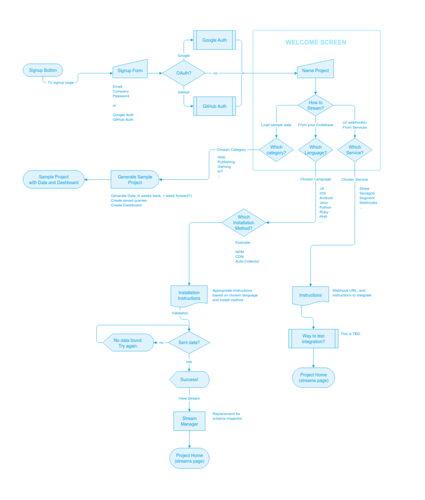
We spent the morning sketching out a variations of interfaces and interaction sequences to tie it all together. Once we felt good about the high-level details we produced a series of high-fidelity mockups. These were then loaded into InVision and turned into an interactive demo.
Friday: Interviews
Our first customer interview began at 9:30am sharp, and began with a conversation guided only by a few open-ended questions about their past experiences with Keen. I used QuickTime Player to capture each session as a screen recording.
Here are a few of the questions I used to guide our conversation:
- “From when you first signed up, how much time passed before you felt confident that things were set up and running correctly?”
- “Was there ever a moment when you felt stuck or unsure of what to do next? Did you ever need to contact support for anything?”
- “If you could go back in time and give yourself one bit of advice before getting started, what would that be?”
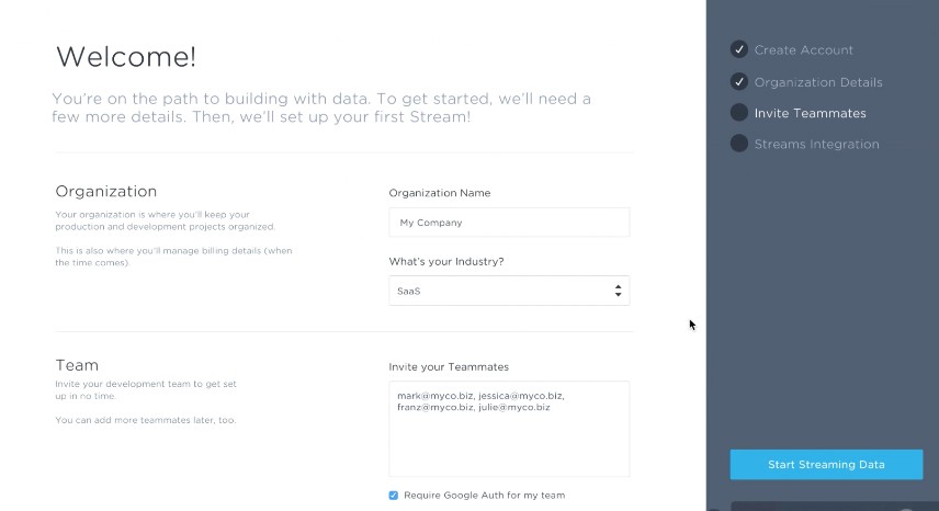
Next, I shared the link to our InVision demo and offered minimal instruction on what to do. I simply asked them to imagine they are signing up for a Keen account for the first time, and to share out loud what they are seeing, thinking, and doing along the way.
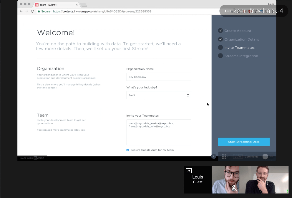
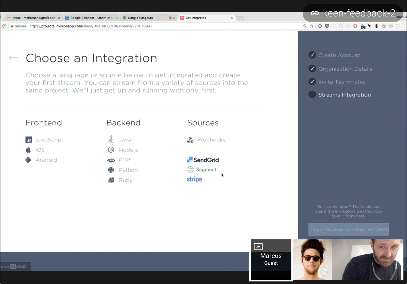
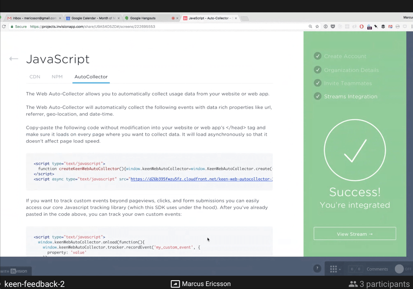
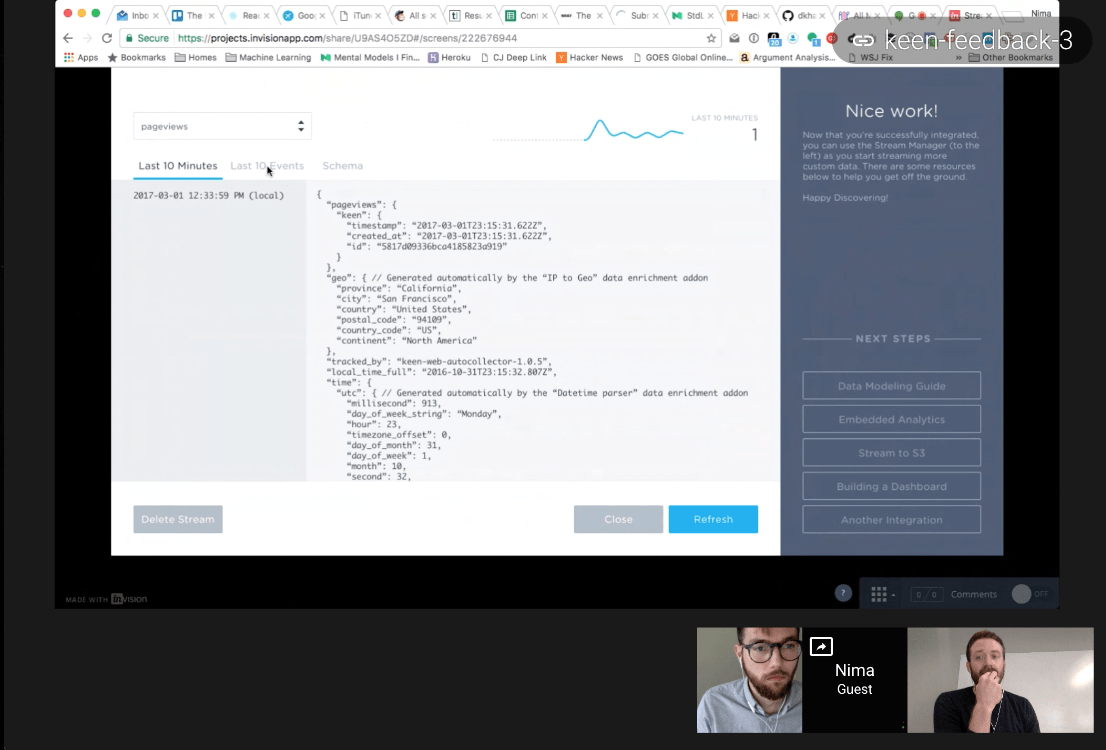
By lunchtime we had two and a half hours of hands-on feedback. Here are a few screenshots from our sessions:
Here’s what we learned
At a high level, our new critical path held up. Every participant had a positive, enthusiastic reaction to the flow we had laid out. The clear prioritization and focus of getting installed, the explicit “verification” step during the setup process, and the ability to view the data that had been recorded:
- “I like this.. Hated that it took me so long. ‘Choose Integration’ page is the first page I care about.”
- “I like that ‘Verify’ action- satisfying. Nice big green to know it’s working.”
- “Most recent events is where I go.. Good to see all data there.”
There was also a fair amount of confusion around the choice of wording and placement of elements in our prototype:
- “‘Choose an Integration’ is vague.. What I really want to do is send data. They’re all ‘sources’.. All ‘integrations’.. Make it really obvious.”
- “Didn’t notice the side panel.. Seems a little detached. Thought it was part of the InVision app.”
- “Auto Collector blurb on the JS page is out of place and confusing.”
We also heard a common reaction on the prompt to invite teammates during the signup process:
- “Inviting teammates is day-2, I would have blown past that to start playing with data.”
- “I normally wouldn’t invite my team until after I’m up and running. … especially wouldn’t invite people while I’m in the middle of setting things up.”
The results of these sessions were then cycled back into several more design iterations. We are now several leaps ahead of what you see in these mockups.
Outcomes
This week-long research sprint not only sharpened our understanding of the breakdowns of our existing first-time developer experience, but also allowed us to prototype and test a new approach with actual customer input. Shortly after, two project teams were formed to implement our recommendations.
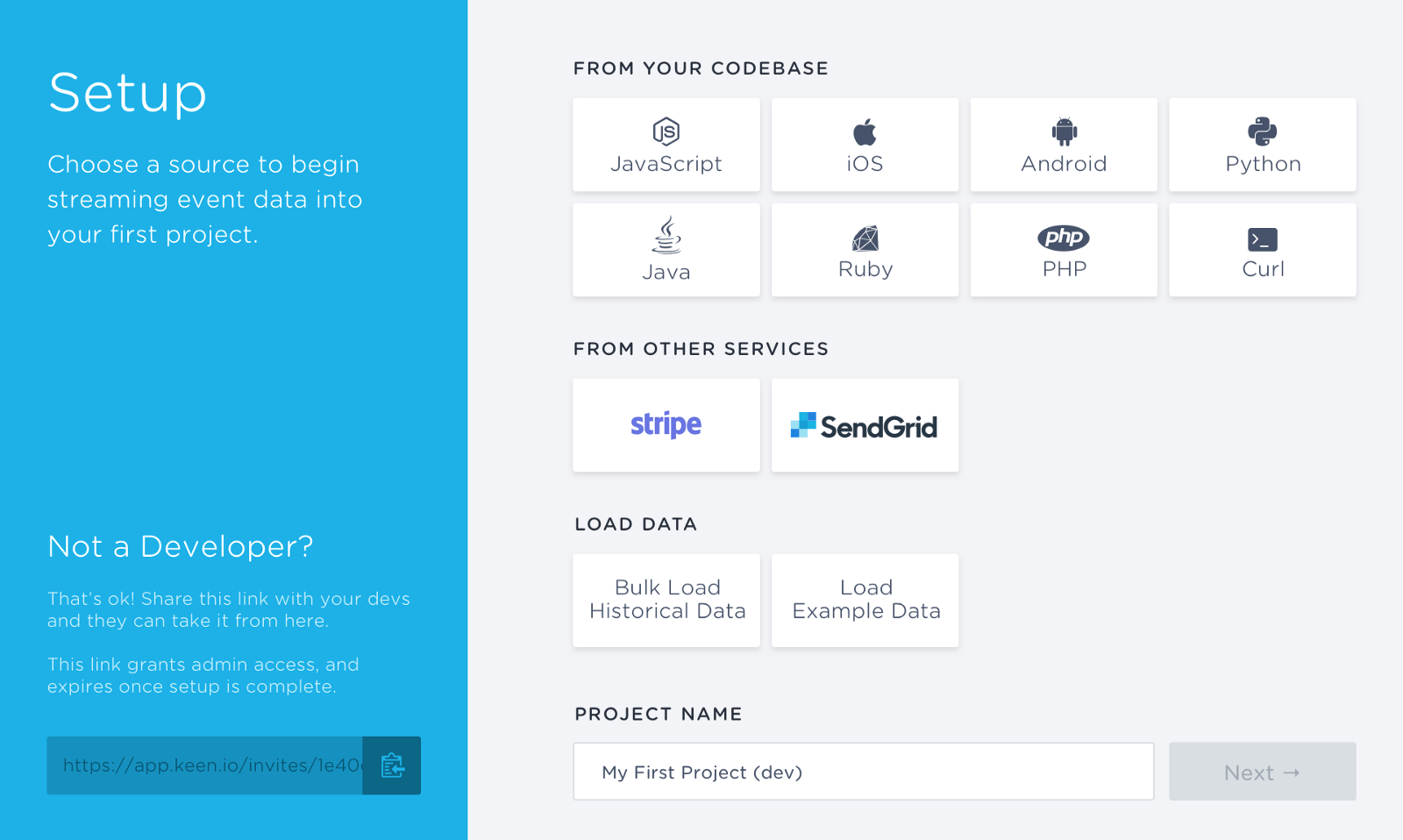
- Stream Setup Wizard that is shown immediately for every new project, featuring a wide assortment of possible integration types, including sample data generation
- Stream Manager App that improves users’ visibility into their event streams while making it easier to expand and manage their usage
- Team invite links that can be shared in Slack or over email, allowing others to join an organization with minimal effort from the original user
- Communication prompts delivered as in-app messages and email, to direct users forward in their journey with helpful content and assistance
The Stream Setup Wizard alone boosted new account activation by 35%. Once the option was added to load a project with sample data, activation jumped again to 65% above our original baseline. Alexa Meyer and her project team did a fantastic job implementing this new feature, and deserve all the high-fives for the impact this has had on our business.
This research sprint only cost a week of our time and less than $100 in account credits, and has had an incredible impact not only on our bottom line, but on the first-time experience of hundreds of new developers who decide to give Keen a try every week.


