This is a guest post written by Chris Rothe, VP of Engineering at Red Canary
Data plays a pretty important role for us at Red Canary. Being a cyber-security company, we monitor hundreds of millions of events every day in search of potential cyber threats to businesses around the world.
Data drives everything from growth and profitability to our technology stack, and yes, even to how we measure and improve the productivity of human beings (our analyst team). We don’t do this to be big brothery, but to ensure we improve quality, control costs, forecast hiring correctly, prioritize workflow optimizations, and keep our analysts from burning out.
Finding diamonds in the rough
Our analysts are the lifeblood of Red Canary. Without them it would be impossible to deliver the unprecedented detection we do. To understand why, it helps to think of our process of threat detection like a diamond mining operation (bear with me):
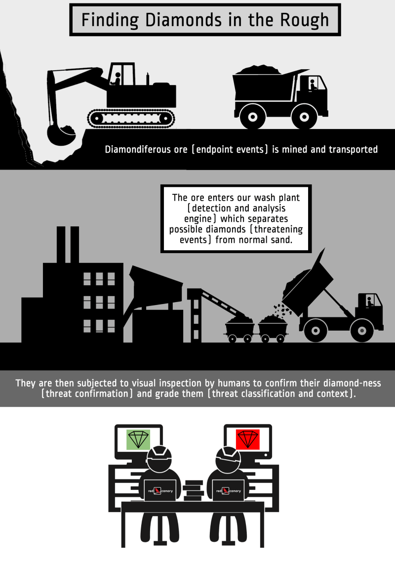
If we were running a hobby diamond mine in our backyard we could process the ore by hand and ensure that no diamonds slipped through our pans. But we are running an industrial operation where it is critical that all of the components are continuously running efficiently and accurately. Not to mention that any small optimization we can make yields the same amount of diamonds at a lower cost, which helps both Red Canary and our customers.
The robotic components of our mine are relatively easy to monitor. We make sure they are on and that they are producing at expected levels.
But how do we measure the analysts who are so fundamental to our ability to find high-quality diamonds?
We measure everything — especially our humans
Despite our rigorous analyst training, feedback program, and mind control initiatives, no two of our analysts do things the exact same way. Measuring how each special snowflake behaves isn’t as simple as measuring a machine, but it is critically important. Our success as a business will always be highly reliant on increasing the number of endpoints each analyst can handle without a decrease in quality (or job satisfaction).
Right, but what do we actually measure? In this case, the most obvious measurements are inputs and outputs.
- How many potentially threatening events is an analyst flagging for review?
- Of those, how many are they confirming as threats, and is that rate consistent with other analysts?
- How long does it take them to process each set of events they flag?
- How accurate is their output? Are they sending false positives to our customers? (to be honest, this isn’t very useful because our analysts make so few mistakes…ahem, humblebrag, ahem…)
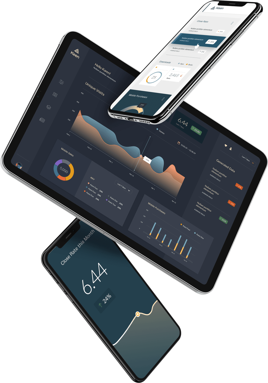
With Keen, it’s easy to visualize data with readymade charts and dashboards. These measurements are essential for tracking how well our analysts are performing and identifying breakage. But what happens when we want to invest strategically in improving the performance of our system to help it scale better?
Profiling our analyst team
For our software components it’s easy to run analytics. We instrument code to profile latency and look for opportunities to cache data to reduce I/O needs, implement smarter algorithms, or remove unnecessary time-wasting complexity. For our meatware components this isn’t as easy. (We tried a Borg implementation, but they balked at the spandex suits.)
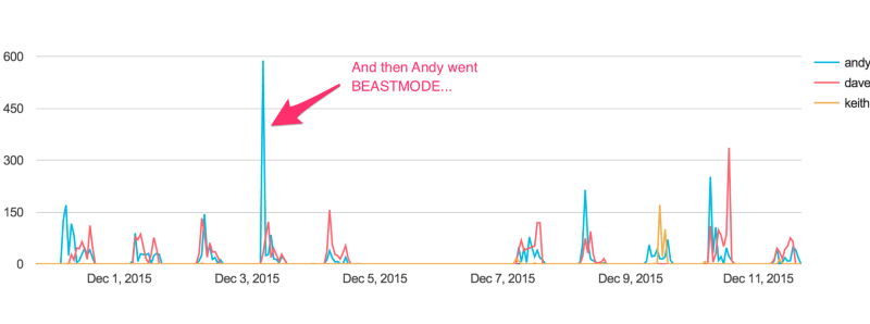
Instead we use Keen to track every movement analysts make while using the Red Canary Analyst Portal, including when they leave it because the Portal failed to provide the necessary information.
We pack a lot of context into the visual representation of a potentially threatening event so we track which pieces are useful. The ones that aren’t used are just visual noise that we remove. Similarly, when we introduce new context we pay careful attention to whether it helps or hurts the overall performance.
As you can see, Keen allows us to track, name, and visualize any type of event, which makes it easy to spot important information.
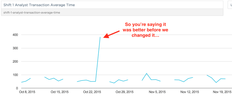
So what? Keen replaces statsd+graphite
When we first started measuring things, we stood up a statsd server, started jamming some numbers at it, built some views in graphite, and generally confused ourselves. Not because the tools aren’t great — they are — but because they did more than we needed and required us to keep more servers alive.
When we found Keen we were struck by how simple and clean it was to get started, organize data, and immediately get value. It is truly a statistics and analytics platform written for developers.
Particularly critical for us was the ability to make our data models as verbose as necessary without incurring additional cost. We weren’t sure what dimensions were going to yield the key insights so we just started storing all of them (or at least the ones we could think of; one 10-minute call with a Keen data engineer helped us identify even more dimensions to add).
Questions like “how long after an analyst is hired do they reach the performance of the rest of the team?” are now simple to answer. Our dashboards are beautiful combinations of aggregate metrics and charts that allow us to quickly assess the performance of our entire system, analysts included. We store many millions of events in Keen per month and are really just scratching the surface when it comes to analyzing the data.
Analytics power our business and Keen powers an important piece of our analytics. We highly recommend trying it out if you want to get more out of your data without the pain of building and maintaining a system in-house.
