Upgraded query building experience, faster load times, modern data visualizations, and more—the new and improved Data Explorer makes it easy to drill down into your event streams and extract meaningful insights.
What is the Data Explorer?
The Data Explorer is a tool in the Keen app that enables you to perform analysis on your data by running queries. Queries have adjustable parameters allowing you to analyze your data however you need. Select time frames and intervals, apply filters, and specify how results should be grouped and ordered. Queries can be run once for ad-hoc analysis or saved and easily re-run for reports that will be used frequently.
What new features have been added to the Data Explorer?
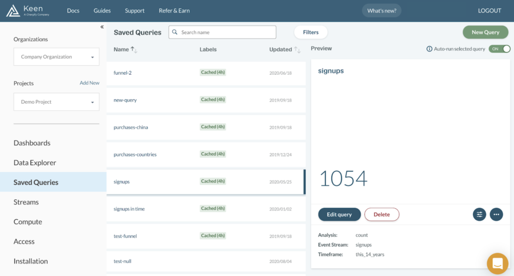
Saved Queries View
We’ve added a dedicated view for managing your Saved Queries with improved categorization and searchability features. Enhancements include: tagging, filtering, and sorting capability as well as additional preview information.
Modern Data Visualization Library
The new Data Explorer uses the revamped Keen Data Viz library with the new Choropleth chart type and additional chart options like stacked, comparison, and difference. The charting experience has also been enhanced with features like: auto-truncation of labels and improved chart legends.
Toggle ON/OFF Auto-run Query Preview
It is now an option to turn off auto-running queries while previewing. This is a great way to reduce query volumes and save on cost.
What improvements have been made to the Data Explorer?
Application Performance
We’ve beefed up the performance of the new Data Explorer so you’ll experience faster load times, even as your event collections and schemas scale.
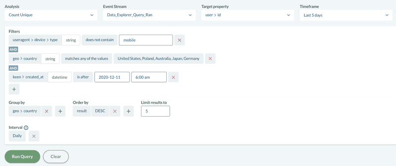
Filter Functionality
Adding filters to your queries wasn’t the most user-friendly in the past—so we fixed that! We’ve renamed the operators to be more clear, updated the property selection format to a searchable tree, and moved the filters to the same view as the other parameters so that everything you need is all in one place.
GroupBy Functionality
The GroupBy functionality has been updated to respect the order of your target properties offering a much more intuitive experience.
White-labelling Data Explorer
Embed the Data Explorer into your application, so that users have the ability to run queries on their own data. We’ve made it easier to white label by supporting custom names for labels. Maybe you’d like to offer your users the option to create “Reports” instead of “Queries”? Now you can!
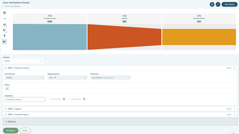
Funnel Analysis
We’ve fine-tuned our funnel analysis by persisting the timeframes to the next step, supporting customizable labels, and adding tooltips to explain optional fields.
Extraction Analysis
The extraction analysis type has been updated to respect the order of input target properties. No more having to re-order columns after export.
What does it look like in action?
Sign in to your Keen account and head to the Data Explorer tab to check out the new and improved product. Here, you can run one-off queries for quick analysis or save a query to be presented in a dashboard.
Creating a query is accomplished in a few short steps:
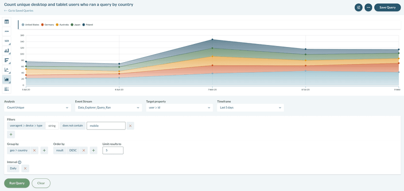
1. Start by selecting the event stream to analyze and the type of analysis to perform. Keen offers 12 analysis types (including raw extractions and funnels).
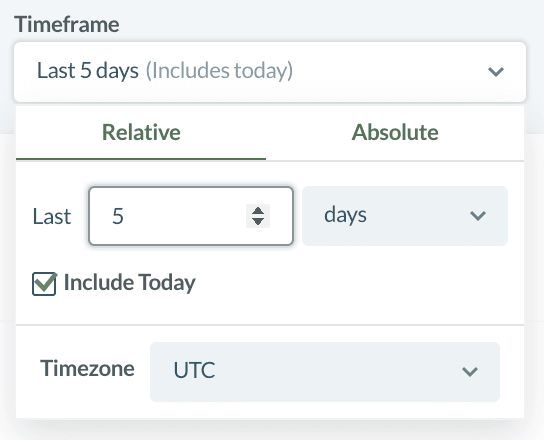
2. Next, select the time frame to perform this analysis over. There are options for relative time frames—like this 30 days—as well as custom date ranges.
3. Optionally, filters can be applied to isolate relevant segments of data. Simply select the property to filter, choose an operator—such as contains or does not contain— and then specify the value to compare.
4. Results can be grouped by one or multiple target properties—like geo-location, device type, or channel. Group by respects the order of input for target properties, so make sure to select your primary grouping first.
5. After specifying the properties to group results by, select to order them by ascending or descending value. Select the number of results to be displayed in the query. For example, limit to 5 to only show results for the “Top 5 countries”.
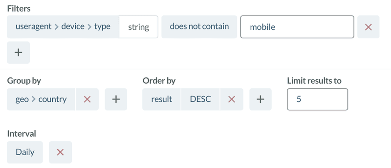
6. Then, select an interval to set the frequency of the analysis results over the specified time frame—such as daily for this 30 days.
7. Select “Run Query” to perform the analysis and a visualization of the results is returned.
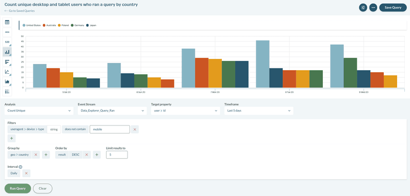
8. Choose one of the 12 chart types to display the query result.
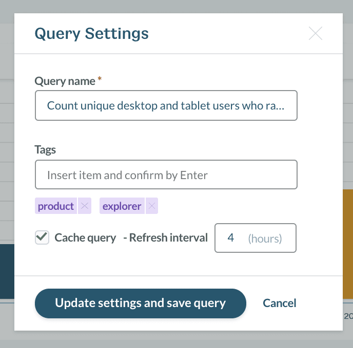
9. Finally, select Save Query to easily re-use this query again. Give the saved query a name, add tags to help with query categorization, and cache the query with a specified refresh interval. Pro tip: Caching is a great way to reduce query volumes and save on cost.
Once you’ve created multiple saved queries—for quickly spot checking popular analysis and building captivating dashboards— you can take advantage of the new Saved Queries view. This new view offers a central location for managing all of your saved queries. Easily locate the query you need with tagging, filtering, and sorting capability. From there, you can easily preview, edit, and clone your existing queries.
What’s to come?
Next up, we will be redesigning our Dashboard Creator, a tool that allows users to present all their saved queries in one place and create stunning dashboards. Customize your dashboard to match the look and feel of your brand, manage access permissions, and easily embed, share with a link, or download as an image. Stay tuned!
Not already using Keen? Sign up for a 30 Day Free Trial to get started today. Happy Exploring!


