You’ve got users. Your conversion rates are looking pretty good. However, your users aren’t really using your product. You have a retention issue. There are different ways of solving retention problems and today we’ll look at how you can use analytics dashboard design to help your end-users understand, get the most value out of, and love your product.
When companies add user-facing metrics and other end-user dashboards to their products, they usually start by building their “MVP dashboard”. This is usually a simple dashboard with a handful of charts.
It’s important to keep in mind that the best customer analytics dashboard designs help users become better engaged and better customers.
Designing end-user analytics dashboards is a tricky task because you need to decide what data to show your users and what data to ignore. Resist the urge to simply give them hundreds of charts and expect them to sort through the noise.
In this post, we’ll walk through 3 principles that you should keep in mind for your analytics dashboard design. You can then use these principles to analyze and deconstruct how other companies decided on their own product analytics dashboard designs.
Use Data to Close the Gap Between User Metrics and Action
Let’s first understand why we want to create analytics dashboards for our users.
Despite the ever-increasing abundance of data, users (and companies) still struggle to take action. This is perhaps best explained in the Paradox of Choice TED Talk which states that as you give people more choices, their ability to choose (or take action) decreases.
Barry Schwartz had a great quote on “learning to choose”:
“Learning to choose is hard. Learning to choose well is harder. And learning to choose well in a world of unlimited possibilities is harder still, perhaps too hard.”
Source: The Paradox of Choice: Why More Is Less
This is where user analytics dashboards and data comes in. We can help our users “choose” better options by presenting them with relevant data.
If done well, a great end-user dashboard can do the following:
- Inform and motivate on progress: You can remind your users how much they have accomplished and how much closer they are to their goal.
- Provide a complete and holistic picture: You can provide the user with a complete picture and better experience by pulling data from different sources. This tends to apply more to business use cases than consumer ones.
- Incentivize continued usage: You can also inspire your users to continue using your product while still getting value out of it.
The goal isn’t to have all the data in the world. We simply need to find the metrics that will be relevant and useful to our users. Like most things, this is an iterative process where you get better with time.
Universal Design Principles Behind Actionable End-User Dashboards
If you’re just starting to research how to track the right metrics to show your users, we recommend putting a tracking plan in place. This simple document (usually a spreadsheet) can help you organize all of your events and properties in one place.
Let’s assume you’ve already completed the process of finding the right metrics for your users. Instead, let’s focus on the design and structure of the end-user dashboard. For that, we can look at 3 principles that can help you decide what data to show and what to ignore.
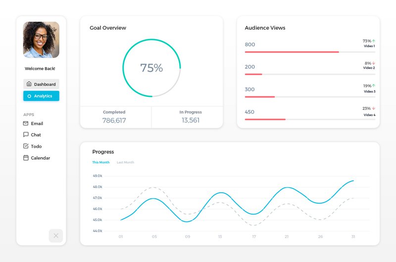
Principle #1: Make It Visual
Numbers are great, but visuals are even better. Visuals like charts allow us to communicate more information and make it easier to digest.
Let’s look at Mailchimp, an email marketing software. One of the core numbers that a Mailchimp user wants to know is their number of new newsletter signups.
Instead of simply showing the number of new signups, Mailchimp shows the overall change in “audience”. This metric takes into account users who unsubscribed or who provided fake emails.

There are different options for visualizing your data including common chart types like bar, pie, and trend lines. You can also look at providing segments within a given chart e.g. ne3wsletter audience changes by list.
We can see the number in the top left and we can see a bar chart that shows us the changes broken down by day, week or month. The bar chart is showing us the trends within the selected data period.
Principle #2: Provide Context By Comparing Numbers Against Other Periods
Our second principle is about comparing data against other periods. Numbers by themselves don’t mean much. Is 15% good or bad? We simply don’t know until we add context and say “15% compared is good compared to 12% last month”.
Many companies will let you compare “this month vs last month” or “this week vs last week” which is a great start. You could also compare against other date periods which give even more context such as:
- This month vs a rolling 6-month average
- This month vs projections (set by user)
- Greatest or smallest change
Mint.com offers these types of date comparisons in their product analytics dashboard. For example, you can see the overall trends within a 12 month period in the graph below:

The average, greatest change and least spent provide context for your financial numbers. Am I projected to spend higher than my average? Am I now spending higher than the “Most Spent”?
Mint also sends out alerts when your numbers divert from the average as seen in the example below:

The examples and screenshots above show user analytics that are embedded directly into an application – this in-app experience is what we call customer-facing metrics, also called user-facing metrics. Both of these examples of user-facing metrics are powerful because they show how you can compare numbers against other date periods to add more context.
Principle #3: Overviews and Then Allow Drilldowns
The first screen or page of analytics that your user sees is critical. This usually functions as an overview of the most important metrics from which they can click into a given metric to dig deeper.
When thinking about your analytics dashboard design, and developing your user metrics overview screen/page, keep a few things in mind:
- What are the 4–5 things that I want my users to know? You might want them to know 20 things but the overview only gives you enough space for a handful of numbers.
- What kind of drilldowns do I want my users to take? You showed them a critical metric and now you want them to dig deeper into that number.
- What actions do I want my users to take? Besides the drilldowns, what do I want users to do after they learn about “X number”?
Remember that end-user analytics data is all about taking action. Always keep thinking of what you want your users to do and what data they need to take action.
Ahrefs does a good job of providing a user analytics dashboard overview screen with the ability to do drilldowns on specific numbers.

Conclusion:
Great analytics dashboard design is half science and half art. The art part is all about trying to understand what and how to display the most valuable metrics to your user, while the science part is about tracking how your users are engaging and using your dashboard (and product). If you’re thinking about creating a custom embedded dashboard for your customer, Keen has created tools and templates for building API-based computations and visualizations that make it easy to get started with user-facing metrics.
Do you have any other useful tips for how to design a user analytics dashboard? Reach out to us on Facebook, LinkedIn, or Twitter, and let us know!
This article was originally published February 2017 and was updated December 2019.


