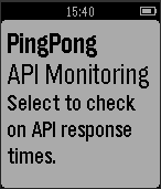
As the market for connected devices keeps growing, there are a ton of cool possibilities for how you can connect the data you collect to these devices (and how you collect data from them). Today, I’ll show you how to build a Pebble smartwatch app with built-in data and analytics features. What do I mean by this? Well, as an example, I built a Pebble app that displays charts and graphs of API response times.
I used Keen IO to collect and query the data, and Pingpong, one of our open source projects, for monitoring API response times.
Read on to see how we put the pieces together, then get started tracking and querying in an awesome project of your own!
Download the full source code for the app here: https://github.com/keen/pingpongpebbleapp.
Things You’ll Need:
- A free Keen IO account
- A Pingpong instance — an open source project that uses Keen IO as a backend to monitor API response time
- A Pebble smartwatch
- A basic understanding of JavaScript
Connecting to Keen via Pebble.js
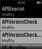
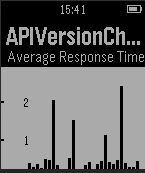
Our goal here is to build a simple app on the Pebble smartwatch that runs a query to get a list of all of the API checks our Pingpong instance are running, along with a more detailed summary page for each individual API check that shows the last 30 minutes of activity.
The first part is a little tricky — we need to get a list of all the checks that Pingpong makes, but Pingpong itself does not have an API end-point to pull the check information. We can get around that by knowing that the checkscollection can provide that info via an API call:
runKeenQuery("average", "checks", {
    target_property: "request.duration",
    group_by: "check.name",
    timeframe: "this_2_minutes",
    interval: "minutely"
}, function(keenRes) {
The response contains all the information we need, namely the check.namefield that gives us each of the individual checks. The runKeenQuery function is just a convenience function that wraps the
That runKeenQuery call is the same one that populates the more detailed view of a check, just with an additional filter applied:
runKeenQuery("average", "checks", {
  target_property: "request.duration",
  group_by: "check.name",
  timeframe: "this_30_minutes",
  interval: "minutely",
  filters: JSON.stringify([{"property_name":"check.name","operator":"eq","property_value":e.item.title}])
}, function(check) {
These two calls are the main crux of this application, but can serve as a basis for any Keen query integration. Once the query returns, you have easy access to the resulting JSON and can then integrate that into the application in any number of ways.
Example of Using Result Data
For this watch app, I wanted to create a little graph that showed the resulting response times. Since no charting library existed, I wrote a basic script to translate the query results into drawn rectangles.
The response JSON from the Keen query looks something like this:
{
   "result":[
      {
         "value":[
            {
               "check.name":"APIBeacon",
               "result":0.571653392125
            }
         ],
         "timeframe":{
            "start":"2015-01-21T19:24:00.000Z",
            "end":"2015-01-21T19:25:00.000Z"
         }
      },
      {
         "value":[
            {
               "check.name":"APIBeacon",
               "result":0.41270526775
            }
         ],
         "timeframe":{
            "start":"2015-01-21T19:25:00.000Z",
            "end":"2015-01-21T19:26:00.000Z"
         }
      }, {...}
   ]
}
To turn this into a graph, I normalized the result field, and then multiplied the normalized number by the maximum x-axis height of the graph (adding a little padding so that we next max out the height).
for (var ndx in averageTimes) {
  var height = Math.floor((averageTimes[ndx] / scalar) * maxHeight);
  var currentYPos = yPos + (maxHeight - height);

  checkCard.add(new UI.Rect({
    position: new Vector2(currentXPos, currentYPos),
    size: new Vector2(width, height),
    backgroundColor: 'black'
  }));

  currentXPos += width + 1;
}
This crudely draws out a rectangle for each result, making the bar graph.
This is just one basic example of using query results to display information, but there are a bunch of other possibilities — not to mention the possibility of sending data to Keen based on interactions with your app. If you have questions or ideas, feel free to shoot me an email, or tweet me @alexk_k.


