In 2018, the Center for Disease Control and Prevention (CDC) estimated that around 40% percent of the world’s population is living with some sort of disability, whether that be physical or mental. That’s a 25% jump in the United States alone, according to a 2011 study conducted by The World Health Organization.
Keeping with this trend, the number of lawsuits against brands for failing to provide accessible websites tripled from 2017 to 2018, exceeding 2250. With a significant sector of the population living with disability, UX designers must take into account the diverse capabilities of their intended users to offer the richest experience possible, especially when it comes to data reporting.
So, how to approach this? We’ve covered some key concepts to think about when creating new data reports, heralded by accessibility designers in all industries and fields.
1. All disabilities are not one and the same
Disabilities come in many forms and manifestations. At the most basic level, they are either physical or cognitive. Physical includes visual impairments, hearing impairments, and motor disabilities. Cognitive disabilities, however, include learning impairments like dyslexia, and memory and spatial reasoning difficulty.
With such variation, designers must accommodate the variety of new tech to an increasingly diverse audience, says Bo Campell of Uxiverse in the famous UX Collective blog. For example, for developers working on visual UX exclusively, he recommends incorporating easy access auditory cues that explain data metrics for those visually impaired. For those implementing a voice UX assistant into a site, remember those with auditory disabilities, and be sure to include subtitles and easy access volume buttons, says Campbell.
2. Keep Visuals Clear and Contrasted
By building graphs with bright colors that contrast against the background, those with poor visibility, whether permanently or temporarily, can clearly see the information conveyed. On one hand, there are basic requirements related to visual design and UX. This could range from comprehensible instructions and forms to large, clear capitalized fonts, to contrasting colors that allow text to stand out on a page.
Masatake Okabe and Kei Ito, both researchers at the University of Tokyo, have created a guide called Color Universal Design for designing for color blindness. They recommend colors that contrast and are distinguishable but also can be seen by non-colorblind and colorblind people of all types– protanopes (red cone cells defective), deuteranopes (green cone cells defective) and tritanopes (blue cone cells defective).
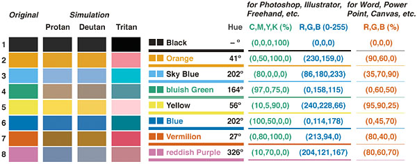
Researchers recommend using these eight colors in visualizations because while they appear different to those with color blindness than those without, they are nonetheless distinguishable.
Kei and Ito also advise creating highlighted text, symbols, and lines in blues and violets, since protanopes (most common color blindness) can’t easily distinguish dark red from black.
Ensuring that users can interpret text clearly through magnification without becoming illegible is also important, warns the World Wide Web Consortium (W3C), as those with cognitive disabilities can better understand text in a visually clearer manner.
For those with auditory limits, subtitles on videos are important says Bo Campell. This comes into play with the rise of voice user interfaces, too, as sites are incorporating bots and other intelligent systems and typical VUI, like Amazon Alexa or Google Home, are on the rise.
3. Leverage white space
For dividing sections of a graph, white space, negative space, or the space surrounding other design elements, can be extremely powerful.
There are two types of white space–macro and micro–and use of both address different disabilities.
Macro white space, which surrounds entire elements, allows the brain to process information faster, especially those with spatial reasoning difficulties. It also helps to divert attention to one or two elements on the page, rather than presenting the user with a cluster of information. The Interaction Design Foundation explains that for users with Attention Deficit/Hyperactivity Disorder, this can be immensely helpful.
Likewise, micro white space helps to define objects within a graph or bar chart when color differences between metrics doesn’t suffice.

4. Color Should Not Be the Only Visual Cue
While whitespace helps, InVision UX Designer and accessibility specialist Pablo Stanley recommends using something with a text label or to create charts with patterns as well as color. When showing down trends in simple statistical infographics, for example, he suggests not to rely on red text alone to highlight a trend’s decline, but include a down arrow, hazard, or frowny face icon, as well.
Stanley also recommends playing around with shapes and sizes within a data visualization (that don’t necessarily directly represent to that which is being conveyed). For example, line charts with different line styles (striped, solid, dotted) can make all the difference for those with inability to see color.

Vizzes can also be made more accessible by labeling data directly instead of relying exclusively on legends, which necessarily require color interpretation. This may also just make for a faster read for those with or without disabilities.

5. Use Technical Markers to Convey Metrics
Oracle suggests that for the visually impaired, UX designers should design data tables and images — i.e. charts and gauges — that have alternative text options in order to be translated into programs that read aloud content. Oracle also suggests that designers define table summaries, titles, and headers very explicitly. If you frequently use Microsoft products, this guide will show you how to alt-text enable them.
Additionally, research conducted by a joint MIT-Harvard team discovered that on average, users read the titles of graphs before even looking at the graph itself. So, Cole Nussbaumer, a designer and author for Storytelling with Data, suggest that when graph titles include the point, the main trend (i.e. “Value of Gold Plummets” instead of “Value of Gold Over Time”, the cognitive load can decrease.
Supporting keyboard navigation by designing usable focus states is another option, says Paolo Stanely. The blue or light gray dashed outlines that may show up around links or buttons is a focus state, which users can navigate through with a keyboard using the tab or other control key. A common way that most people do this is by using tabs when proceeding to the next input in a form. For users who can’t operate a mouse or trackpad, this determines whether they can use an entire site. For interactive visualizations that require hovering for more information, focus states are something designers ought to consider integrating.
6. Ultimately, simplicity is key
But what are UX designers to do when they go beyond simple website layout to create data tables? According to Web Aim, an advocacy organization for web accessibility, the core concept is simplification. When a table is being broken down by a screen reader, it may be overloaded by the various rows and columns. Essentially, Web Aim suggests that when it comes to table structure, “the simpler the better.”
Oracle similarly suggests various design choices to forgo in order to avoid overcomplicating a table. These overcomplications include nesting various kinds of data into a single table — in order to condense a report — and separating a table’s header from its body.
While some UX designers try to show off their skills, thing to remember is that UX should prioritize the user over a designer’s need to impress. For accessibility purposes and otherwise, designers emphasize this all the time.
7. What’s intended to benefit some might result in a better solution all
Elsie Roy, a disability rights lawyer and design thinker, believes “when we design for disability first, you often stumble upon solutions that are better than those when designing for the norm.” In her Ted Talk, she explains that her being deaf gives her a unique way of experiencing and reframing the world which, she believes, could solve some of the largest problems. She offers one of the first tech examples: texting was originally created for deaf people, until it was picked up as a quick, easy method of communication by everyone else.
For data visualization, that could mean discovering an unprecedented but more efficient way to display the same information. What could be better?


