Let’s face it: not everyone who tries your app is going to stick around to use it again. Not all of your customers are going to keep paying you month over month.
Not to worry, retention analysis can help us figure out how many people we’re losing and determine if this is something we really need to worry about.
A retention analysis will allow you to see, in numbers, things like:
- What percentage of your users are coming back week after week?
- What percentage of your users are paying month after month?
- Do people typically stick around for months, or leave after a few days?
- Did that product overhaul you released last month increase retention or hurt it?
Meaningful Metrics
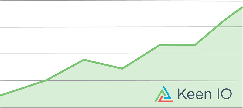
It’s not hard to make a graph that looks like this. Invest more in advertising and marketing each month and you will see your usage increasing over time.
A company with a chart like this could have abysmal retention, though. Perhaps all the users in a given month are NEW users, and none of them are going to stick around to make this app profitable.
That’s why retention analysis tells a more compelling story than “number of users doing x”. A retention analysis tells the story of “users doing X over time”.
Keen IO Cohort Analysis — 15 Weeks
Here’s an example of a retention analysis I ran recently using this Ruby script.
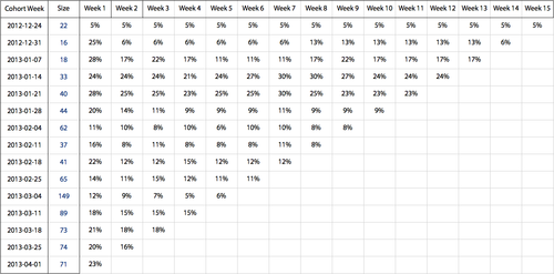
Reading down the left-most columns, you can see the number of accounts that have been created in Keen IO each week. Moving right across the table, you can see the percentage of those accounts that sent data in the weeks since they signed up.
This view wasn’t quite what I was looking for, though, because the concept of retention doesn’t apply very well to users who signed up but never took any action. So I ran the analysis again in a slightly different way.
Better Keen IO Cohort Analysis — 15 Weeks
Just like the previous chart, this next chart shows the percentage of accounts we successfully “converted” to sending us data in Week 1. The difference is that the subsequent columns show the percentage of those “converted” accounts that continued to send us data in subsequent weeks (rather than the percentage of all accounts in the cohort).
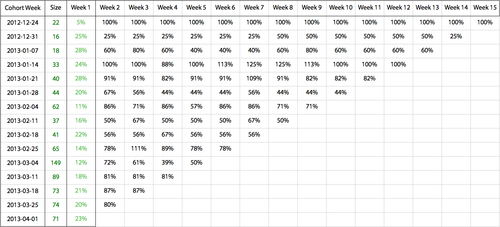
What did this retention chart tell us?
- Our Week 1 conversion has stayed at roughly 20% all year.
- Once a company starts sending us data, they generally stick around. Week 8 retention is well above 50%. We probably have more to gain by focusing on getting new accounts rather than improving retention.
- In March we experimented with advertising. That boosted our signups a lot the week of March 4th. But the overall conversion of those accounts was low relative to the typical conversion of accounts we get from our blog traffic. Our ads attracted people to signup, but they weren’t our ideal customers.
Why do some weeks have over 100% retention? Sometimes more of a cohort’s accounts send us data in a subsequent week than they did in Week 1 when they signed up. Some orgs start sending data months after they signed up!
How to run a Retention Analysis
I ran this analysis using the Keen IO funnel API. Each cell in the table is funnel query where the first step is creating an account and the second step is the engagement activity (in our case sending data). I wrote a Ruby script to generate the funnel queries and output the results into an excel file. The script takes as inputs:
- Keen IO account info (e.g. your Project ID & API key)
- Number of weeks back you want to run the analysis
- Funnel query steps
This chart explains how each cell value is calculated using the funnel query results.
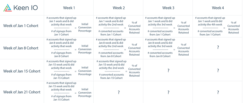
The retention analysis script works by dividing your users (cohorts) into groups based on the week they did step one of the funnel — some initializing activity like signup, create account, download app, or submit first payment. Something like “create account” works better than “launch app” because users only create accounts once. It’s a clean way to make sure each user fits into one, and only one, of the cohort buckets.
The second step of the funnel checks if the users in a given cohort did an engagement activity in a given subsequent week. Engagement will vary depending on your app but could be something like login, launch the app, submit content, take a picture, post a comment, submit a subscription payment, or make a purchase.
Using these two-step funnel calculations over a given number of weeks, the script traverses each of the weeks and outputs the results in an .xlxs file.
Questions? Shoot us an email or join our devs google group!
– Michelle


