With endless troves of biological, ecological, and financial data, there’s so much to be done to tackle problems of keeping the planet safe. However, sometimes this data overload can be difficult for a single person to comprehend it in the abstract. For that reason, researchers and policymakers have relied heavily on data visualizations in order to convey the scale of the potential for positive environmental impact at a glance.
Several visualizations online in the environmental category have emerged as clear winners, standing out from the average bar graph. While it was difficult to narrow down, we believe that these top ten projects represented both unique research perspectives and artistry.
Here’s Keen.io’s pick of some great environmental data vizzes online today:
1: A Night Under the Stars
For those readers who love to camp, check this out. Vincent takes a bird’s-eye look at park visitor data and seasonal weather data, carefully calculating the most optimal nights to sleep outdoors in each of America’s National Parks. Employing a radar chart, Vincent shows the reader when and where to camp, categorized by type of landscape and lodging.

2: How the Thai Rescue Mission Unfolded
While covering the breaking news of last summer, at its core, this visualization it details how the monsoon-like conditions and surrounding environment trapped the twelve Thai boys in the underwater cave. For those who had trouble following along in the text with how, exactly, they got into the cave and why it was so difficult to get them out, check out this great visualization.

3: What Happens to the Plastic We Throw Out
As part of NatGeo’s investigation of the impact of plastic on the environment, they created this viz to demonstrate the harrowing scale of mismanaged plastic waste throughout the world.

4: How the US Generates Electricity
Often described as the largest machine in the world, this viz demonstrates that the US’s electric system is adopting more sustainable sources for electricity generation. Using a bubble map chart and bar graphs, this viz demonstrates the US’s decreasing reliance on coal as it embraces renewables like solar, hydro, and wind power.

5: The Level is in the Details
Designer Michael Mixon visualizes each day from 1900 until 2016 that local weather channels reported a record-breaking high temperature in each US state. Using radial charts, Mixon very clearly demonstrates the increase in record-breaking highs in the last quarter-century, as red dots tend to be concentrated around the fourth quarter of each circle (each circle runs clockwise from 1900 until 2016).

6: Protecting Common Swift Breeding Sites: A Lesson from Amsterdam
This viz looks at the shifting Swift bird species’ nesting habits in Amsterdam over time, and how the UK, also their natural habitat, can learn how to best conserve the species in developing and urbanizing.

7: A Good Life
This visualization of radial and radar charts successfully compares the social and environmental goals that global nations meet (or don’t). The designers demonstrate the trend where developed countries meet social and humanitarian goals while overspending environmental resources while developing countries struggle to meet social goals but are more conservative in their natural resource usage.

8: City Eyes
This visualization visualizes every single daily average temperature in several cities from 1970 until May 31, 2019, in one single, colorful ring. The viz begins at the center in January ‘70 and finishes at the edges in this year, demonstrating temperature rise as the outer circles seem, to the eye, redder. The visualization tracks temperatures in Tel Aviv, Berlin, New York, San Francisco, Stockholm, Sydney, and Shanghai.

9: Satellites: 60 Years in Orbit
Slightly outside of our immediate atmosphere, Russian data scientist Segodnya made an interactive visualization of the history of satellites in Earth’s orbit, who owns them, and their purposes for being up there still since the first launch of the USSR’s Sputnik in 1957.

10: Lights On & Lights Out
This map visualizes both the increase and decrease in light pollution at night (blue and pink, respectively) across the globe, using light usage as an indicator for population growth, development, and light and electric pollution reduction.

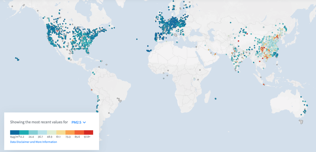
11: Fighting Open Air Quality
Keen.io customer, OpenAQ, uses open-source data to visually map air quality measurements globally. It can also take the user’s location and map how their air quality compares to two other cities in the world at random, providing measurements on everything from carbon dioxide levels to particular matter (PM) levels.
With innovative mapping techniques and radial graphs, the methods the artists used to build environmental vizzes are equally applicable in any industry, whether it’s SaaS, gaming, or cybersecurity. This process of taking complex, arcane information and making something both quickly comprehensible and beautiful is one that can be done seamlessly, particularly with the right software tools to make it happen.
To learn more about building visualizations like these with your data, click here to schedule a demo with Keen.io.


