User Behavior Metrics
Let’s say you want to learn:
- which pages are most popular on your website
- which pages your customers visit first and last
- from which pages your customers perform certain actions
- how many customers use one feature and/or another feature
You can use Keen to dig into various page view and feature usage metrics!
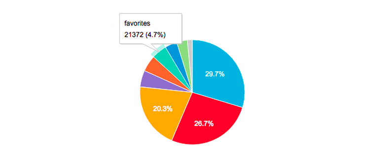
Top Viewed Pages
To visualize the breakdown of page views, you can create a piechart using Keen’s data visualization library.
var client = new Keen({
  projectId: "YOUR_PROJECT_ID",
  readKey: "YOUR_READ_KEY"
});

Keen.ready(function(){

  var timeframe = 'last_7_days';

  var pageNavCount = new Keen.Query('count', {
      event_collection: 'screenviews',
      group_by: 'screenname',
      timeframe: timeframe,
  });

  var pageNavChart = new Keen.Dataviz()
    .el(document.getElementById('page-nav-chart'))
    .chartType('piechart')
    .height(300)
    .prepare(); // start spinner

  client.run(pageNavCount, function(err, response){
    // if (err) throw('Error!');
    pageNavChart
      .parseRequest(this)
      .render();

  });
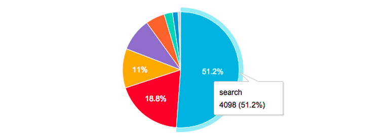
First Page Navigation From Homepage
If your user sessions typically begin on your homepage and you’d like to see which pages customers navigate to next, you can set up an event property to keep track of next_page. Since this property will be available on all pages, you’ll want to set a filter so you’re only getting the results for your homepage. You’ll also want to set a filter so you’re only looking at homepage views at the very beginning of a session. Adding an event property like session_age will help simplify query analyses.
var client = new Keen({
  projectId: "YOUR_PROJECT_ID",
  readKey: "YOUR_READ_KEY"
});

Keen.ready(function(){

  var first_screen_nav = new Keen.Query('count', {
      event_collection: 'screenviews',
      group_by: 'next_page.screenname',  // Count which pages get the most navigations to them
      filters: [
        {
          // Only look at navigation from the homepage starting screen
          property_name:'screenname',
          operator:'eq',
          property_value: 'homepage'
        },
        {
          // Only look at events in the first 15 seconds of a session
          property_name:'session_age', // (seconds)
          operator:'lt',
          property_value: 15
        }
      ],
      timeframe: timeframe,
  });

  var firstNavChart = new Keen.Dataviz()
    .el(document.getElementById('first-nav-chart'))
    .chartType('piechart')
    .height(300)
    .prepare(); // start spinner

  client.run(first_screen_nav, function(err, res){
      // if (err) throw('Error!');
      firstNavChart
        .parseRequest(this)
        .render();

  });

});


});
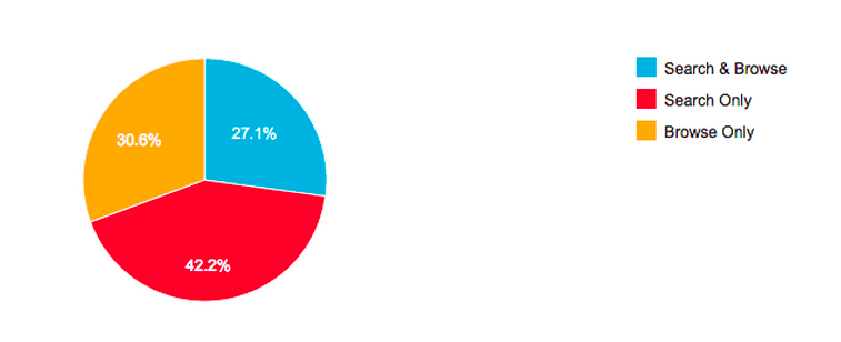
Search and Browse Behavior
You can use a funnel to calculate how many people browse through your website, how many people only use search, and how many people do some combination of browsing and searching. Note: this recipe applies to data models where completed sessions can be tracked.
var client = new Keen({
  projectId: "YOUR_PROJECT_ID",
  readKey: "YOUR_READ_KEY"
});

Keen.ready(function(){

  var searchFunnel = new Keen.Query('funnel', {
      steps: [
        {
            // i.e. Completed sessions
            event_collection: 'session_end',
            actor_property: 'session.id',
        },
        {
            event_collection: 'screenviews',
            actor_property: 'session.id',
            filters: [{
                // e.g. someone searches for something
                property_name:'screenname',
                operator:'eq',
                property_value: 'search'
            }]
        },
        {
            event_collection: 'screenviews',
            actor_property: 'session.id',
            filters: [{
                // e.g. someone browses content
                property_name:'screenname',
                operator:'in',
                property_value: ['favorites','latest']
            }]
        }
      ],
      timeframe: timeframe,
  });

  var searchBehaviorChart = new Keen.Dataviz()
    .el(document.getElementById('search-funnel-chart'))
    .chartType('piechart')
    .height(300)
    .prepare(); // start spinner

  client.run(searchFunnel, function(err, response){
      // if (err) throw('Error!');

      // response.result has one entry for each funnel step, like: [180, 141, 68]
      var sessions = response.result[0];
      var sessionsWithSearch = response.result[1];
      var sessionsWithSearchAndBrowse = response.result[2];
      var sessionsWithBrowseOnly = sessions - sessionsWithSearch;
      var sessionsWithSearchOnly = sessionsWithSearch - sessionsWithSearchAndBrowse;

      var formattedSearchBrowseData = {
          result: [
            {
                name: 'Search & Browse',
                value: sessionsWithSearchAndBrowse
            },
            {
                name: 'Search Only',
                value: sessionsWithSearchOnly
            },
            {
                name: 'Browse Only',
                value: sessionsWithBrowseOnly
            }
          ]
      };

      // Visualize modified data
      searchBehaviorChart
        .parseRawData(formattedSearchBrowseData)
        .render();

  });

});
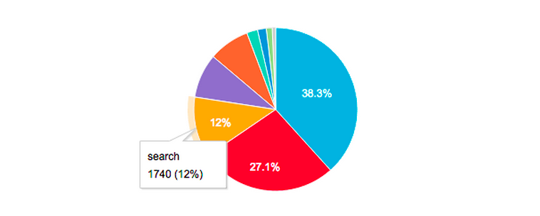
Page Before Abandonment
If your data model is set up in such a way that you can track session endings, you can easily see what pages users are on when they complete their sessions. Depending on your session definition, ‘session end’ may coincide with when users leave your website.
var client = new Keen({
  projectId: "YOUR_PROJECT_ID",
  readKey: "YOUR_READ_KEY"
});

Keen.ready(function(){

  var pageBeforeAbandonment = new Keen.Query('count', {
      event_collection: 'session_end',  // i.e. Completed sessions
      group_by: 'screenname',
      timeframe: timeframe,
  });

  var pageBeforeChart = new Keen.Dataviz()
    .el(document.getElementById('page-before-chart'))
    .height(300)
    .chartType('piechart')
    .prepare(); // start spinner

  client.run(pageBeforeAbandonment, function(response){
      // if (err) throw('Error!');
      pageBeforeChart
        .parseRequest(this)
        .render();
  });

});
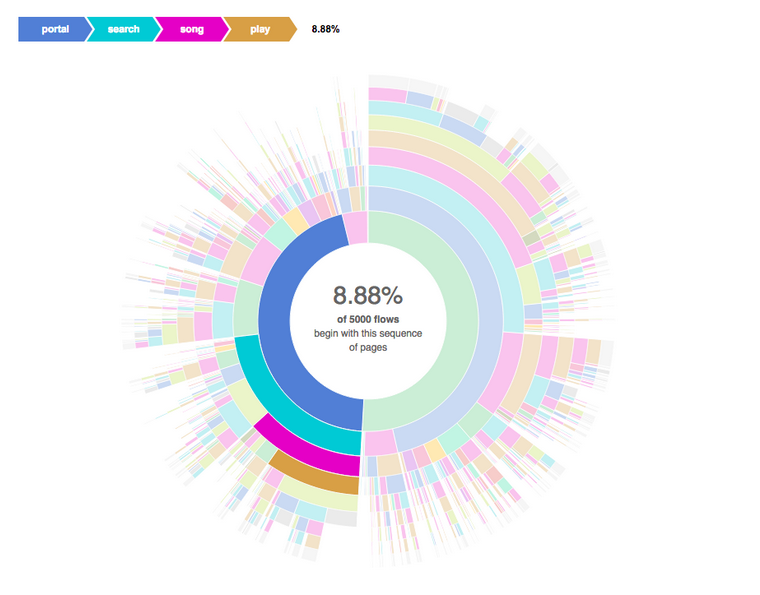
User Flows
One really cool way to visualize user flows (i.e. the order of events in user sessions) includes the D3 sunburst visualization. Here’s a recipe for how to create a sunburst (i.e. radial flow) visualization for your Keen data.
What’s Next?
Talk to our team to get started. If you’d like to learn more about how to get the most out of your data, reach out to Schedule a free data consultation with our data science team.
