Have you ever obsessively refreshed a dashboard to check your favorite stats? Fitness, finance, travel, sports, politics, gaming, trending cat-memes, whatever…
I’m guessing the answer is: Of course. Who hasn’t? I’m doing it in another tab right now!
At Keen, we talk about the business value of data all the time. For teams, customers, companies, decision-makers. Numbers make everyone smarter. Charts and graphs = insights! And that’s true, definitely. But I think there’s another piece of the data story, and this is it: people just love their data. They’re into it.
Why?
Maybe I should warn you that I’m trained as an English teacher, not a data scientist. But I believe the real reason people go crazy for data is because it’s a concrete manifestation of an abstract desire.
Okay, I know, you think I’m your crazy English teacher from junior year, but hear me out on this.
What are things that people want?
Success and Mastery: This one is obvious. All those Key Performance Indicators for company and personal growth. Users subscribed. Miles run. Levels upped. Retirement dollars saved. Success is a feeling but a bar chart is a rectangle, and a rectangle is real!
Love and Belonging: Love may be the most complex human emotion, but stats on Tinder are surprisingly precise. A friend recently showed me his dashboard and said he now knows, with mathematical certainty, what his type is (and whose type he is).
Significance and Impact: Who hasn’t watched the counter tick up and up on how many people like the picture of your child, or dog, or spouse, or brisket? How many re-tweets you got when you came up with just the right witticism about that thing that happened?
When it’s done right, data taps into some serious emotion.
So we’ve decided to share some of the data we love, why we love it, and what we can learn from it. To kick things off, here are the top two data obsessions on my list.
Data Obsession #1: Flightdiary.net
I love to travel. To be more specific, I love to rack up frequent flyer miles in creative ways and see how far they can take me. And I mean I want to see it!
That’s why I flipped when I found Flightdiary.net. It is an aviation geek’s dream. I enter my flights and then they get visually represented on a map of the world.
Colors represent how often I’ve flown a route: yellow for once, red for twice, purple or purpler for three or more, white for flights yet to be flown.
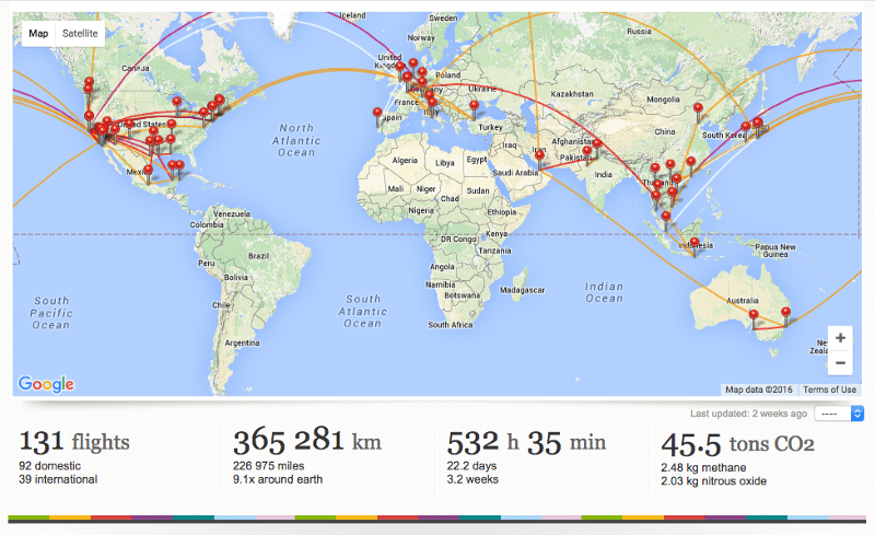
Why do I love this? Because, as Tears for Fears sang in the 1980’s, everybody wants to rule the world. It used to be you needed an armada for that. Now I can just admire my colorful lines on this map and suddenly I am an explorer of continents, discoverer of destinations.
But what if I want to know more?
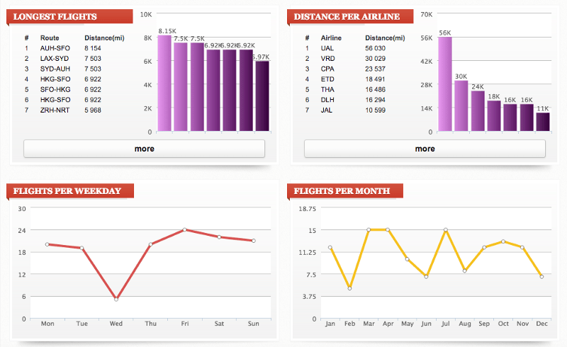
Of course I want to know more, and that’s why I can look at graphs of my top routes, longest routes, flights by airline, by aircraft, by seat location.
What’s in it for Flightdiary?
Sometimes I ask myself this. Mostly I ask because I want to make sure they survive so I can keep building my empire. And they don’t charge me any money for it, so what’s the deal?
Honestly, I don’t know. But I speculate that they are working to get me hooked, and then in the future they will use the data to show me ads or send targeted offers based on all the stuff they know about where I like to go.
That’s just a guess. But I wouldn’t mind, because they’re not just using my data for their own purposes. They’re letting me get value out of my data, too. In this case, the value is emotional, but what’s better than that? I like emotions.
Data Obsession #2: Querytracker.net
Like many English teachers and copywriters, I harbor an ambition to publish a book someday. And I have learned from past experience that writing the book is not the hardest part of the bargain. The most challenging part is getting an agent.
It sounds so Hollywood: getting an agent. Like something that happens by magic. But I don’t want to stake my dreams on magic. Dreams are dreamy enough as it is. I want to invest in data.
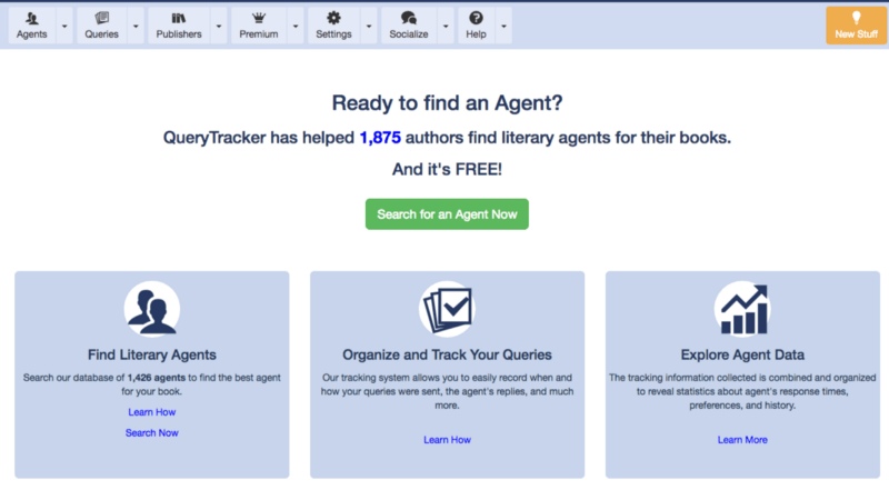
That’s where Querytracker.net comes in. This website maintains a database of all known literary agents. I can sort by genres they represent, whether they’re open to new clients, where they’re located, etc. I can save my favorites, keep track of all my queries and log the responses.
That’s amazing, and it’s all free!
But what if there’s a premium membership with even more data?
Well gee whiz, am I going to skimp on my dream? No way! I ponied up my 25 bucks like they were on fire. And here’s some of the stuff I got for it.
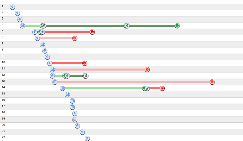
Data Timeline This feature shows me all the data points (without user info) of other members who have queried a particular agent. So if an agent hasn’t responded to a single soul since 2013, I know to save my heartache for another day.
By contrast, if a particular agent seems to be lightning quick with rejections but more reflective about requests for pages, then I know the data is giving me permission to be hopeful about a slow reply.
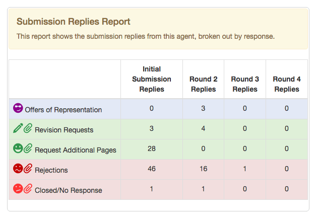
Premium Reports With these velvet-rope reports, I can see things like Submission Replies broken down by whether there was no response, a rejection, a full or partial manuscript requested, all the way up to the ultimate response: an offer of representation.
Learning from Data We Love
It’s only natural to analyze the value of data in purely numeric ways. Of course you should consider the numbers. And showing customers their data can absolutely pay off in very measurable ways: higher signups, referrals, advertising revenue, premium feature upgrades, and more.
But I think there’s a meta side to the whole analytics equation. By measuring and quantifying things your customers care about, you can get intangible benefits as a happy side bonus. Things like: loyalty, enthusiasm, buzz, excitement that might make them write blog posts about you (note: Flightdiary and Querytracker have no affiliation to me or to Keen — I just think they’re awesome.) As Nir Eyal puts it, you can use data to get your customers “hooked” on your product.
Do you want to use data to enhance customer love?
It’s actually pretty easy to build analytics into your app, site, game, or device so you can show customers the data they care most about. In fact, Bluecore built a customer-facing dashboard in less than 24 hours!
If you want to know more, you can check out our guide on building customer-facing analytics or drop us a line at team@keen.io
And if you have some data you love that you’d like to share on our blog, let us know. or ping us on Slack.


